Showing posts with label typography. Show all posts

3.11.2014

10 Lovely Complimentary Typeface Combinations


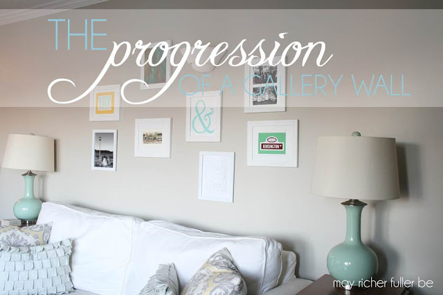
As I was brainstorming and pulling together the new look for the blog recently, I started thinking a lot about complimentary typefaces while choosing a couple for May Richer Fuller Be. Not to be dramatic, but they can make or break the look of something - whether it's a brochure, website, company logo, etc. Typefaces (or fonts) evoke a certain feeling and it's important to choose ones that represent what you're doing well. 

When you're in a creative field like blogging and design, there are some questions you (I) need to consider like: What looks good together? What doesn't? What looks professional? Does it reflect me and my style the way I want it to? Who is my audience?

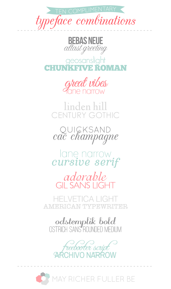
Now I don't claim to be a professional graphic designer, but I've learned a thing or two along the way as I've put together client projects and my own, and I thought it would be a fun exercise to try and pair together ten complimentary typefaces. It was harder than I thought, but I loved getting to play with fonts I don't normally get to use! It was easy to come up with the first five-ish, but after that it got a little trickier. The list you see at the top is my final list. What do you think? Do you have any favorites?

So how do you pair together complimentary typefaces? There are no hard and fast rules, but here are a couple of things to think about and try:

  • If you have one fancy cursive typeface, pair it with a simple, sans-serif one
  • Typefaces with similar physical attributes such as letter width and height often go together well
  • Letter weight plays a big role, so try putting together a super bold and super light typeface

Typography can be really fun to play around with - all you have to do is start!

Feel free to steal any of these combinations you see above. I think a lot of them would be great on invitations, blogs, ads and cards among other things :). Many of the ones listed above are free to download (check the fine print on commercial vs. personal use) - just Google the names. Some are also pre-installed on your computer, so check there too.

In case you'd like to see more typeface combinations like these, head on over to my Graphic Design Pinterest board. There are lots mixed in there!

Pin It!

2.05.2014

Washington, DC Neighborhood Map Art


I'm really excited to share a new print that's up in my shop with y'all today! It's a piece of typographic art that includes all the neighborhoods of Washington, DC - my current home! My hope this will be the start of a series of prints of many places all across the United States (and maybe the world?). One step at a time... :).

The inspiration for this print came partly from my Richmond Fan District art (also available in the shop!) and partly out of a shirt I bought in St. Barth that had the names of all the beaches and towns on it. I tend to make this kind of art when I'm feeling sentimental about a place, and DC is certainly one of those places. We'll be leaving here in just a few short months to move onto our next adventure (more on that soon). It'll be fun to hang this in our new home as a reminder of the past couple of wonderful years in this city. Our little neighborhood is tucked in there somewhere!
This print is available for instant download in an 8x10 size. It's easy to print at home on 8.5x11 inch card stock, which you can trim to fit an 8x10 frame. It's available in any of the colors you see above, but I can also customize them to be anything you'd like! Just email me at mayricherfullerbe{at}gmail.com or message me on Etsy with your idea.

I printed one myself in the green and blue colorway and added it to my gallery wall. Y'all know I like to switch that art up all the time!


I also love making custom art, so if you'd like one of these that's in the shape of your hometown, state or favorite place, let me know! And if you know anyone who loves DC, please send them on over to my shop - I'd love to get the word out on this print.


Do y'all have any art that represents your hometown or where you currently live? Are you as sentimental about leaving a place as I am when you move?


Pin It!

7.02.2013

June Project Round-Up


It's that time of the month again - no not that time of the month! (bad joke?) - it's time to take a minute to look back at the projects I did on this little ole blog over the past month. This is a great way for you to catch up on anything you missed, or if you're new here, it's like a highlight reel, so you can click around easily and find posts that are of interest to you.

If you find you like what you see, you can always have my posts delivered to your inbox (fill in your email address in the "follow by email" form on the sidebar), follow MRFB using an RSS feed reader like feedly or Bloglovin', or find me on Facebook and Twitter. I'd love for you to stick around awhile.

So what did I have going on here in June? Well, let's start with my favorite projects...

The appliqued onesies and customized burp cloths definitely topped the list. I gave the two sets I made to a couple of my cute pregnant friends, and they were definitely hits! I love giving handmade gifts.


My other favorite project was the coral and gray dipped side table. It's just such a fun piece!


I started a new semi-regular series called "Defining My Style" where I'm showing off some pretty photos of homes I love - room by room - that I feel represent my style. Last month I covered exteriors and entryways, and showed the current state of our tiny entry to our apartment.


I DIY'd a whiteboard out of an old frame to hang on that little sliver of wall on the right side of the door to liven up that space as well as add some functionality. We've definitely been using it a lot!


The most viewed post in June was on how to create a font out of your own handwriting. I was actually pretty surprised by that - and I'm glad I'm not alone in thinking that was a pretty darn cool idea :).


Operation {Re}Organization continued kinda casually this month. I conquered some little things like the freezer and a trick to speed up your dishwasher routine.


And lastly, I designed this little print for the Lilly Pulitzer Style Soiree Series and it makes me smile every time I look at it. You can download it for free here if you've got a spot for it in your home, or if you'd like to give it as a gift.


Before I go, I'd also like to give a big thanks (and a virtual hug) to some wonderful blogger ladies who featured my posts this month:


And of course, thank you for reading my little blog!


Pin It!

6.12.2013

Lilly Pulitzer Typographic Quote Art {Summer Soiree Style Series}

**Update: You asked, I answered! This quote art is now available as a free printable. To download it (it's designed to print as a 5"x5" square), go here! If you'd like a different size, let me know and I'll get it to you.** 
---------
Guess what it's time for?! Another installment of the summer soiree style series! (Phew, that's a lot of alliteration.) Take a look at that link above for the introduction to this fun once-a-month series hosted by Jenna at Rain on a Tin Roof and four other lovely ladies. This month's inspiring style icon is Lilly Pulitzer, and she's always been a favorite of mine. When I heard about her passing back in April, I couldn't help but be a little sad to have lost such an influential designer. Her timeless, colorful dresses were a staple of my "dressy" wardrobe in middle school and high school, and I still have a few of them in my closet. Last night I even tried to dig up a few photos of me wearing them, but alas, I think they're stored on my external hard drive, so you'll have to wait on those. No middle or high school Chaney photos in this post - too bad ;).

For my little project this time around, I decided to design a simple piece of typographic art using one of her famous quotes. It's a tribute, in a way, to her wonderfully playful designs, and I hope that it captures a little bit of her design aesthetic and attitude towards life.


"Being happy never goes out of style." - Lilly Pulitzer

To make this,  I used this swatch (below) of one of her designs to use as the border and fill for the word "style." I pulled the colors for the rest of the words from the swatch as well. It was fun playing around with the colors to see what looked best and made the quote "come alive."


In case you're into typography like me, and are curious, the typefaces I used were Bebas Neue and Altast Greeting. These are definitely two of my current faves. (And they're both free if you want to download them yourself!)

I'm keeping this post short and sweet today and letting the art speak for itself. Hope you enjoy it! I'm considering making it a free download if I get enough interest - I think it would look so cute in a frame on a summer mantel or even sitting on the edge of a desk - so let me know in the comments or on Facebook if you'd like a copy!

Have a great Wednesday :).

Psst! If you missed last month's Kate Spade-inspired project, you can read about it here.

---------


Pin It!

6.11.2013

How To: Create a Typeface Out of Your Handwriting


Confession #1: I'm in love with typefaces {fonts}.

Confession #2: I'm also in love with pretty handwriting. I even like to practice my own handwriting and prefer to write in cursive. Yep, I'm that nerdy. In fact, funny story, I had a friend in college who had the most beautiful script handwriting and I had major handwriting envy, so I set out to try and write like her. I practiced. Over and over...in class as I was taking notes, in my journals, grocery lists...you name it. Though my cursive handwriting still isn't nearly as pretty as hers, I still love to try.

So where am I going with this? Well, since I love both typefaces and pretty handwriting, wouldn't it be cool if I could make a typeface out of my very own handwriting? I think yes :). Anyone else think that's a fun idea?

I recently learned that this is possible thanks to a free online tool called My Script Font, which takes a scanned image of your handwriting and turns it into a font you can install on your computer. So I gave it a shot using my own handwriting. It's silly and totally imperfect, but so fun! So allow me to introduce you to the Chaney font:


I used my "block print" handwriting for this one. I love how the uppercase letters came out, but am not as wild about the lowercase. It looks more kid-like than I think my "real" handwriting does.

Just for fun, I created a few squigglies too (the last row - in coral).

So how do you do it?

Step 1: Go to My Script Font and download the template. Print it out. Write out each letter in its designated box with a black, felt-tipped pen (I used a fine point Sharpie).

One hint: try to keep your letters in line with their examples for best results. DO NOT write outside their boxes. On my first attempt, I had a problem with wonky spacing between letters because I wrote outside the box.

Step 2: Scan the template in to your computer as a JPEG, TIFF or PNG. Here's what mine looked like:


Step 3: Name your font on the site and click "send file." It'll generate your font for you to download.

Step 4: Download your font and install it on your computer. If you don't know how to install it, go to the bottom of this post for instructions.

Step 5: Open your favorite word processing application (i.e. Word) and select your font from the font list. Type away and play with your new typeface!

I can't wait to experiment some more with this tool. It's so easy to do that I'm definitely going to make another one (maybe more like my cursive?!).

Have any of you tried this with your handwriting? Or do you plan to after you read this awesomely nerdy post?

---------


Pin It!

5.02.2013

April Project Round-Up


Quick announcement: The set of 13 vintage kitchen canisters/spice jars I wrote about last week is now up for sale in my shop. If you're interested, or know someone who might be, shoot 'em the link! Thanks!

---------

It's always fun for me to take a look back at the past month and remember all the projects that kept me busy (and creating!). This once-a-month project round-up post is also a great resource to catch up on posts you may have missed. Onetwothree go!

I shared a couple of yummy recipes this month: an easy make-it-yourself bruschetta (perfect party appetizer) and s'mores bark. I've found myself dreaming about that s'mores bark - I'll definitely be making it again soon.


You got a chance to see my living room gallery wall develop and evolve into its current state. I'm really happy with it - so glad to check that project, and its growing pains, off the list!


I launched a new print for the shop with one of my favorite verses on it ("We love because he first loved us" - I John 4:19) It's available here if you'd like one for you or as a gift.


This month was "peak bloom time" for D.C.'s cherry blossoms, and I went on a little photo tour of these stunningly beautiful trees. I wish they stayed this pretty forever.


I shared some step-by-step instructions on how to make your own custom iPhone case insert.


Pink and orange seem to be a theme lately since this pleated paper wreath has pink and orange stitching on the pleats. Maybe they just seem like a springy combo?


My outdoor photography tips were by far my most popular April post. I guess y'all are just as into improving your photography as I am!


Since Google Reader is going away come July, I wrote up this super practical post on two alternate feed readers: Bloglovin' and feedly. Feedly fits my needs, but both are great!


And last, but certainly not least, is my favorite project from last month: how to make spoon flowers. They were so easy and turned out so well!


Before I go, I also wanted to thank some awesome blogs for featuring my posts this month. Many, many thanks to: Apartment Therapy (ahh!), IHeart OrganizingBlissfully Ever After, Tatertots and Jello, Serenity Now, and Dear Creatives.

That wraps up the month of April... hey there May! I've got lots of project ideas up my sleeve, so get ready.

Have a great day!

Pin It!

3.20.2013

Mounted Vintage Printing Press Letters


Almost a month ago, I wrote about my barn sale adventures and the vintage printing press letters that came home with me. At the time, I had no idea how I would display or use them, but knew that they were a cool find. Enter my father-in-law and his creative mind (you know, the one who came up with the wood wreath idea?). He schemed up a plan to mount the letters in a way that would allow them to be used for their original purpose - printing! He also has the power tools and the know-how to make it happen, so when we were visiting my in-laws this past weekend, we got to work on this little project.

This isn't exactly a tutorial or how-to, since I think this is kind of a unique project, but I hope it provides some fun inspiration for working with unusual items. A little creativity and willingness to take a chance is all it takes sometimes. Oh, and a carpenter for a father-in-law helps too :).

So allow me to present to you...adventures in mounting vintage printing press letters!

Let's start with the finished product because that'll help in understanding the "how we did it" process. Below you can see the letters all mounted up on a block of wood. Four wood elements work together here to hold the letters in place: a board with grooves, slats, spacers and end blocks. This will make more sense later on...


My father-in-law and I got to work on slicing and dicing the wood.

You can go ahead and make fun of my "work clothes" and "eye protection" - clearly I wasn't dressed properly for working with power tools. I was too eager to get started to change clothes, and rain was coming, so time was of the essence!

We used a table saw to cut grooves in the base piece. The grooves hold the wood slats in place. Look closely and you'll see two grooves already cut, and I'm working on the third.


My father-in-law cut the four narrow pieces for the slats.


I worked on making the tiny spacers that go between the letters, as well as the slightly larger end pieces that hold the rows in place.

These little darlings are the spacers:


We did a test run with one of the letters and a few wood pieces to make sure everything fit together properly:


Then once we finished cutting out all the wood pieces we needed, we assembled the apparatus.


All lined up and ready for "printing" - the blocks have my and my husband's names and our wedding date.


Then we played around with different methods of printing using different combinations of paper, wood, cardboard...all with varying success.


Nothing worked perfectly, but I'm planning on trying it out with some thicker paper or maybe even some foam board - to use it as more of a letterpress than a printing press. We'll see!

Here's one of our better results. I wouldn't exactly call it successful, but we had fun doing it!


I kind of love the letters just as they are mounted up on the board, so it may just end up on display in our apartment.

Anyone else gone out on a creative limb lately? What were the results?

P.S. Extra special thanks to my sister-in-law and father-in-law, who took many of these photos while I was busy with power tools and getting paint all over my hands :).

Pin It!

2.26.2013

Free Font Round-Up

Being the typography nerd that I am, I love love pretty fonts (especially free ones!). When used well, they can really impact the look and feel of something you've designed. I've been collecting free fonts on my Graphic Design Pinterest board for awhile now, so I figured it might be time to share a few with you lovely people. Lots of blogs have put together lists of their favorites (I did that a little while ago here), and I hope that these sets will broaden your font world from the pre-installed ones on your computer. There is definitely some overlap in these lists, but that's ok - it must mean they're good ones, right? :)

Click on the links below the graphic to go to the original post. There are links to each font so you can download and install them to your computer. Installation instructions for PCs and Macs are at the bottom of the post as well.

*Note that all of these are free for personal use, but make sure you read the fine print for each one if you choose to download several of them. If you plan to use them for any items you plan to make money off of, you'll likely need to purchase a license.


/ 1 / A Subtle Revelry / 2 / I Will Invitations Blog / 3 / A Subtle Revelry / 4 / Homemade Ocean / 5 / Nicole's Classes / 6 / Nicole's Classes / 7 / The Handmade Home (Ashley's got a whole series on her blog) / 8 / The Handmade Home


To install fonts on a PC:
  • Download the font (it will be a zipped file)
  • Right click the zipped file you downloaded and click "extract all"
  • Click "extract" to save the font files to your computer
  • Double click the individual font file you want to install to open it
  • In the new window that pops up, click "install" 
  • Close the font file and you're done!
To install fonts on a Mac:
  • Download the font (it will be a zipped file)
  • Double click the zipped file and a new unzipped folder should appear in the Finder
  • Double click the individual font file you want to install to open it
  • In the new window that pops up, click "install font"
  • Close the window and you're done!

Enjoy!

Pin It!

2.20.2013

Barn Sales {+ what came home with me!}

Months ago my mom and I took a little afternoon trip to scope out a couple of "barn sales" about an hour outside DC. A barn sale is like a curated flea market with lots of vintage/antique/painted furniture, housewares, unique "finds" and even a few new items. These sales are open about once a month for a whole weekend. The thrill of the hunt is definitely a part of the experience, and I had such a good time on my first trip that I'll certainly be going back in the near future... ideally when it's warmer...you are exploring old barns after all, and it can be quite drafty in the winter!

The two we visited that afternoon were Chartreuse and Co and Stylish Patina. Chartreuse and Co is the more well-known of the two, with five enormous spaces to explore (housing many things I wanted to take home with me). Here are some examples from their blog of what you'd find:


Apartment Therapy has featured Chartreuse and Co - and you know that's a good endorsement! There's a great article here if you'd like to take a read. This is one of their photos of the barns:


Stylish Patina has a single barn jam-packed with beautiful handmade items, furniture, and vintage finds. They are also stockists for Annie Sloan Chalk Paint (love that stuff) and Milk Paint (need to try it sometime).

This is their barn:


...and an example of their lovely wares:


Adorable right? Who wants to go on my next trip with me?

So now that you've been introduced to the barns, you're probably wondering what I picked up while I was there (at least I'm guessing you are if you've read this far!). I must confess, I've been putting this post off for awhile because the items I picked up are begging for a project - and I haven't figured out what that "project" is yet. Finally (picture me throwing my arms up in surrender), I decided why not share these items with you so you can help me figure out what to do with them!

Here's my "find" - a set of vintage printing press (typography) letters:


There was a whole box of old letters at Stylish Patina's barn, and I knew I could find some to spell out something significant. I dug, my mom dug, and after several minutes of looking through all the letters, I knew what I wanted to spell out. With blackened fingertips from handling years of leftover ink, I arranged the letters to spell out "Chaney & Charlie 5/15/10." Our names with our wedding date (May 15th, 2010). I love the quirkiness of them all. Some older than others, some uppercase, some lower. 


I thought it would be neat to figure out a way to display these words and numbers in a prominent place in our apartment. This is where I could use some help! Honestly, I think they look pretty cool in a photo, which I could then frame, but if I can, I'd love to use the printing press letters themselves.


What do you think? I'm hoping you (and maybe Pinterest?) can help me out!


Have a great Wednesday! I'm looking forward to hearing your ideas :).


Pin It!
Related Posts Plugin for WordPress, Blogger...
Blogging tips