Showing posts with label art. Show all posts

3.25.2016

DIY Large Scale Art & A Few Styling Tips

(Note: Modern Masters provided the Pale Gold metallic paint for this project, but I was not otherwise compensated. All opinions are my own, as always!)

Art. It's a key part of making a room look finished, adds style and personality, and can unfortunately cost a pretty penny for good, quality pieces. I'm all about investing in beautiful pieces that you love, but sometimes that's just not in the budget.

Enter DIY art: the affordable alternative that lets you flex your creative muscles as well! Making art can be totally fun and therapeutic even if you're not what you'd call, ahem, artistic. You can make some beautiful stuff for your home. Promise.

I talked about a bunch of options for DIY-able art here, so if you're ready to take a project like this on, try my idea below or check out the other ones in that post.

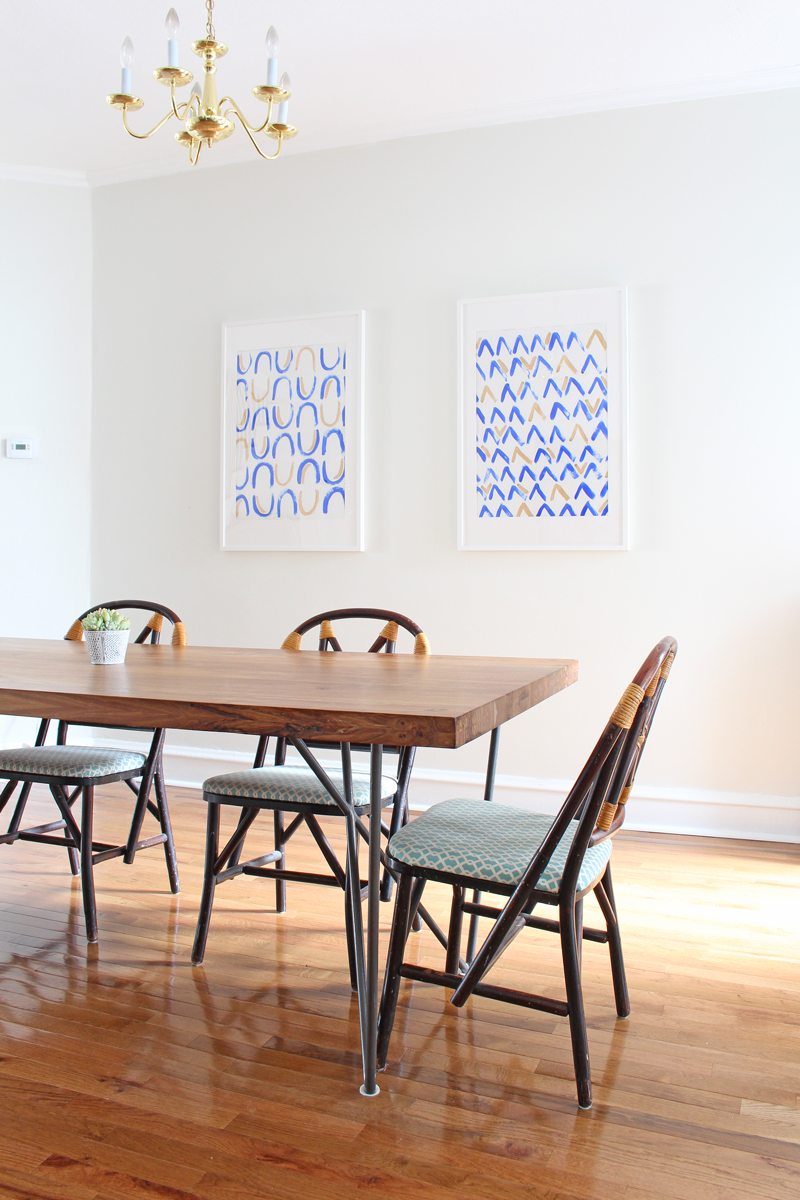
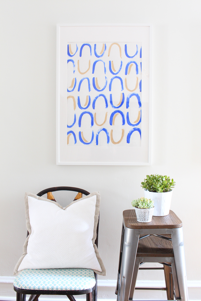
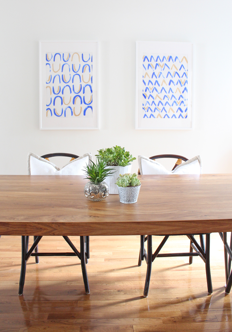
In our dining room update earlier this week, I mentioned that I created these two pieces of large scale art for one of the big ole blank walls in there. Here's where they are:


(*Side note: ugh, I just can't handle that brass chandelier - it's high on the list to replace!)

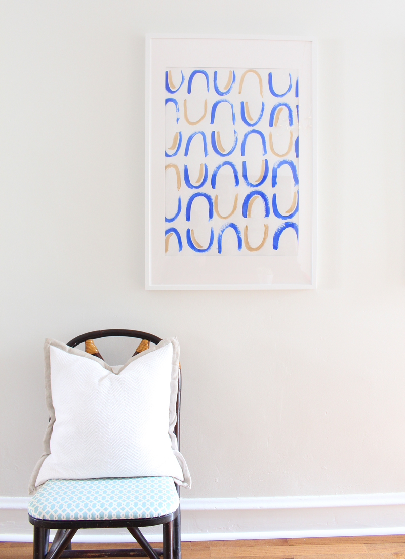
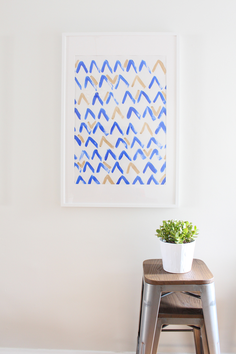
Let's take a closer look at those two pieces. They're super simple to make.


Here are the supplies I used if you'd like to try your hand at making some of your own:
  • Royal blue acrylic craft paint
  • Modern Masters Pale Gold paint from their Metallic Paint Collection
  • Craft paint brush - I used a fat round one
  • White poster board - yep, nothing fancy here! If you mess up, it'll only cost you about 25 cents to start over.
  • IKEA Ribba frame - these are the 24"x35 3/4" size and the poster board fits perfectly in it
I decided to make two patterns: one "U" pattern and one "V" pattern. I sketched these out on a smaller scale first to make sure I liked them and then just went right at it. I chose blue as the predominant color and gold as an accent color, adding it in randomly when it felt right. I was inspired by the mud cloth and shibori looks that are so popular right now and wanted the patterns to look more on the imperfect side. I think I achieved that! 

Plus, perfection is overrated sometimes. ;)

After the paint dried, I popped them in the frames, securing them to the mat with washi tape at each corner.


I like how these two complement each other in color and style, but that the patterns are still distinct from one another. Also, that Modern Masters Pale Gold paint was the perfect metallic touch - it ties the art into the nearby kitchen pendants and the overhead lighting in the living room, all of which helps make these rooms look cohesive, but not matchy matchy. The gold paint is such a dream to work with: it goes on smoothly and is a true metallic with beautiful reflective qualities. Open floor plans can be tricky sometimes!

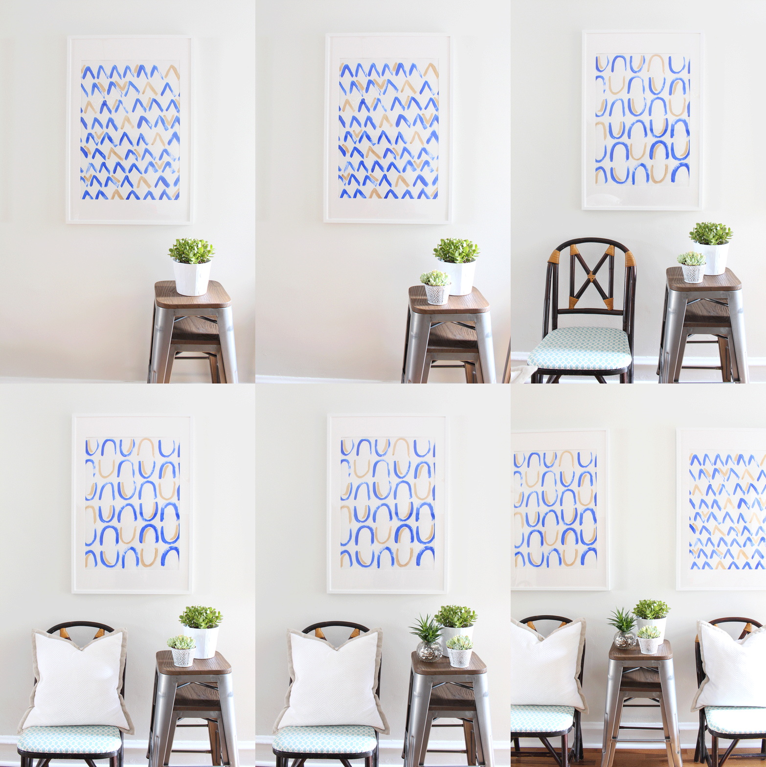
I had a lot of fun figuring out how to style these pieces for photos - styling is always a trial and error process for me - and thought I'd share my process as a fun little bonus for this post! I even made a gif for it - I think that's a first for MRFB! If you can't see the gif, just scroll down. The photos are there individually too.


I started with two stacked stools from our bar area and topped them with a potted succulent (jade)...


Added a second potted succulent...


Brought in a dining room chair...


Then a pillow...


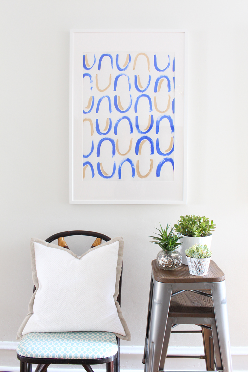
And finally, one more plant for good measure.


I'm not an expert styler by any means, but I've learned a few things that are important to make vignette look great:

  1. Always include something living - either a plant or flowers.
  2. Vary the textures. Here I've mixed in metal, wood and soft fabrics.
  3. Gather items in groups of threes.
  4. Mix up the height of objects.


I hope you'll try some DIY art! It's a fun project that can totally transform a space.

Have a great weekend, y'all!

Enjoy what you read today?  Enter your email address below to subscribe to May Richer Fuller Be!  Delivered by FeedBurner

Pin It!

2.11.2016

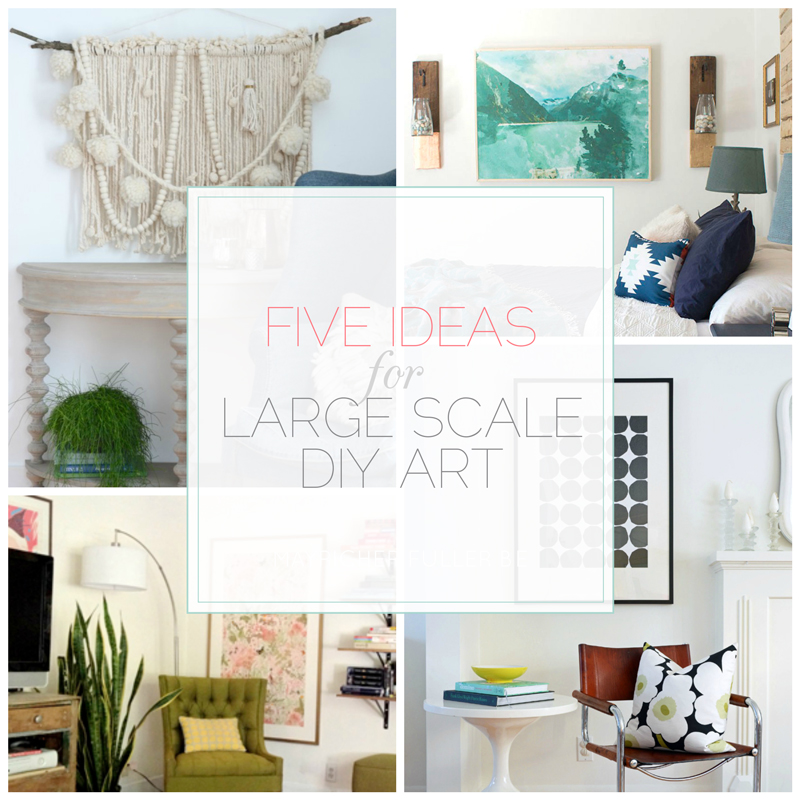
Five Ideas For Large Scale DIY Art {That Don't Look DIY'd}

If you caught my last post about my thrifted china cabinet makeover, you might have read that I'm in the market for some large scale art to flank either side of it. In an effort to keep costs down, I'm strongly considering DIY'ing a couple of pieces. I find that if you're purchasing art, most large scale stuff is either a) expensive if it's original work or b) cheesy if it's inexpensive. (Those two are the extremes of course - I know there's some great, reasonably priced large scale art out there.)

DIY art, on the other hand, can be more wallet-friendly, but I find that the problem with DIY'ing art is that it often looks DIY'd - do you know what I mean? (Hint: not the good kind of DIY.) It can be challenging to make it look really good - at least, that's my opinion.

There IS hope though! 

I found some really great examples of large scale DIY art that I think most anybody can recreate and can be confident that it will look awesome. I've split them up into five categories and have an example or two of each to give you (and myself) some inspiration. Let's get to it!

ABSTRACTS: 

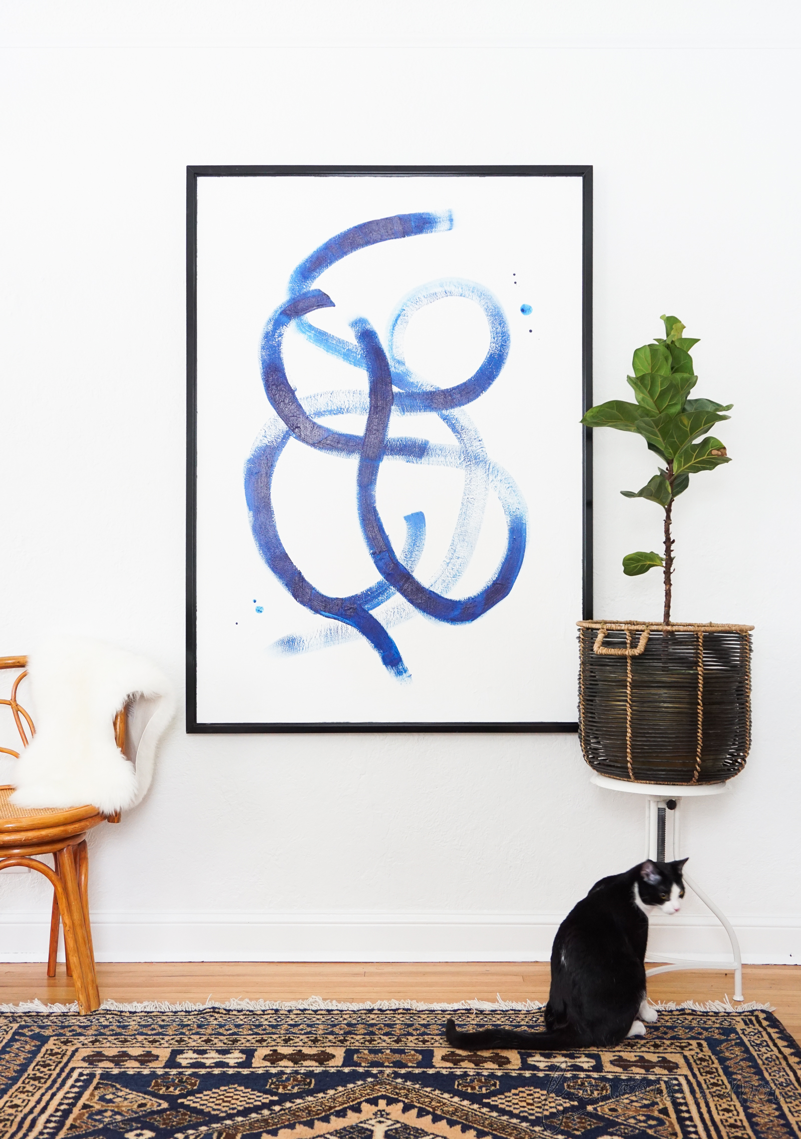
Oh abstracts - how tricky you can be! I painted one that's currently hanging in our living room and am pretty happy with the way it turned out. I'm no artist - I just experimented until it looked the way I wanted it. I'd like to try my hand again soon! There are many, many kinds of abstract art that range from very simple (like the brushstroke art below) to more complex (like the series of three below). Try your hand at both!

Simple Example | Francois et Moi 
{Francois et Moi}
Complex Example | Dans Le Townhouse
{Dans Le Townhouse}

ENGINEERING PRINTS:

Engineering prints are simply large scale copies printed economically on lower quality paper (think blueprints). Black and white ones are super inexpensive, but color ones are also available and are pretty affordable considering the size (the example below was $23). You can have these printed at office supply stores like Staples and then frame them (or don't - your choice!). If you're in the market for a simple, large frame, try the RIBBA from IKEA.

Black and White Example | House By Hoff

{House By Hoff}
Color Example | Mountain Modern Life

{Mountain Modern Life}

FRAMED WALLPAPER OR GIFT WRAP:

There are so many beautiful wallpapers and gift wraps out there these days. Wallpapers can get pricey, but you can search Etsy for remnants that are much more affordable. Wrapping paper on the other hand is more budget-friendly, and its easy to find in small sheets from places like Paper Source and Rifle Paper Co.

Example | Nalle's House

{Nalle's House}
Example | Mint Design Blog
{Mint Design Blog}

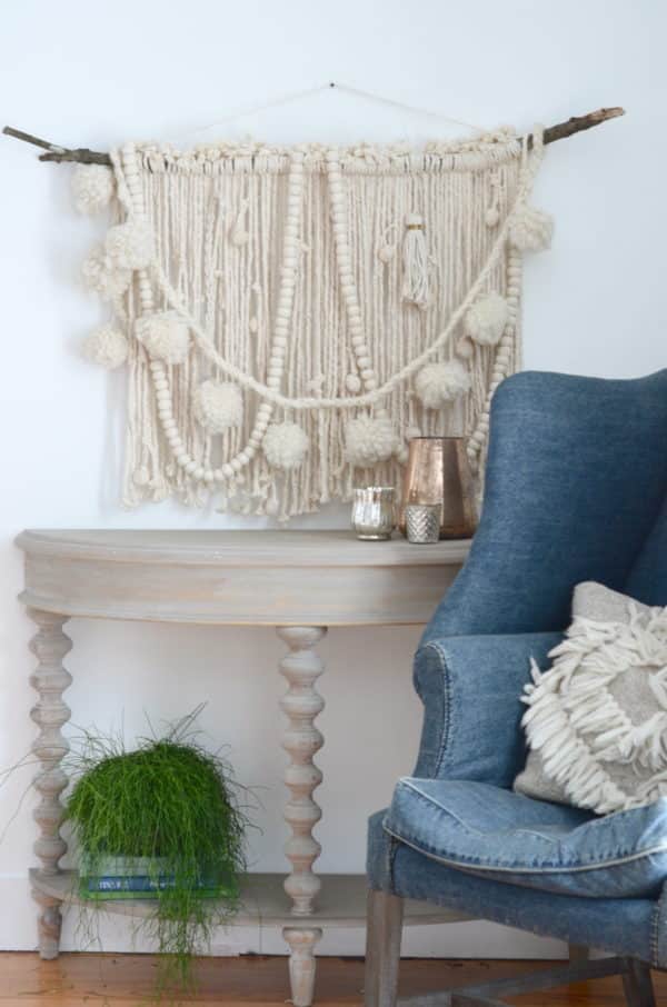
SCULPTURAL WALL HANGING:

The Nester has a fantastic step-by-step tutorial showing you how to make one of these, which starts as - you'll never guess - a mop as its base!

{The Nester}

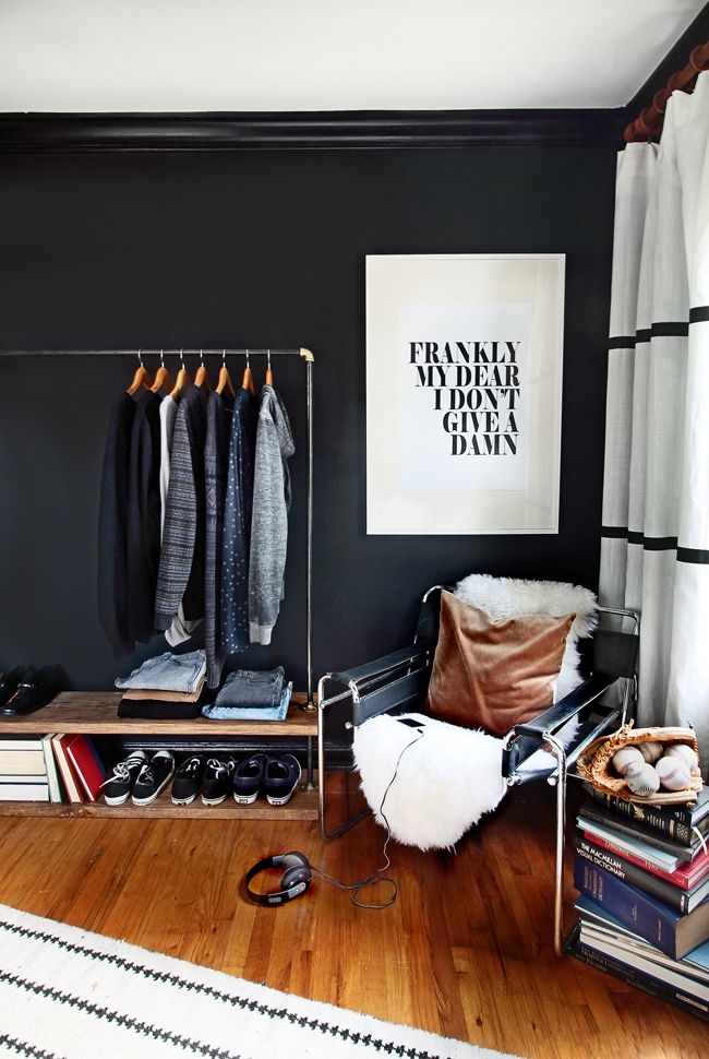
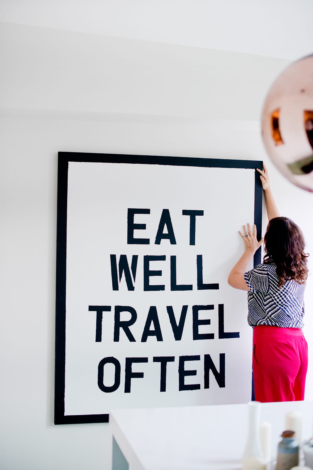
OVERSIZED TYPOGRAPHY:

If you have Microsoft Word, Powerpoint, or just good handwriting you can do this! Choose your favorite phrase, type it out and have it printed at your local copy place, or write it straight onto a canvas. My best advice? Keep it simple for the biggest impact.

Example | The Hunted Interior

Kristen purchased this print with the iconic phrase from Gone With The Wind from Letters on Love (a shop that doesn't seem to exist anymore, unfortunately!), but you could certainly recreate something like this yourself.

{The Hunted Interior}
Example | Katalina Mayorga via Refinery29

{Refinery29}

Well! My creative wheels are definitely spinning now with all this research I've done, and I'm thinking it might be time to create something for my dining room. How about you? Are you ready to make some art? Do you have other DIY ideas you think I should try?

Enjoy what you read today?  Enter your email address below to subscribe to May Richer Fuller Be!  Delivered by FeedBurner


Pin It!

4.29.2015

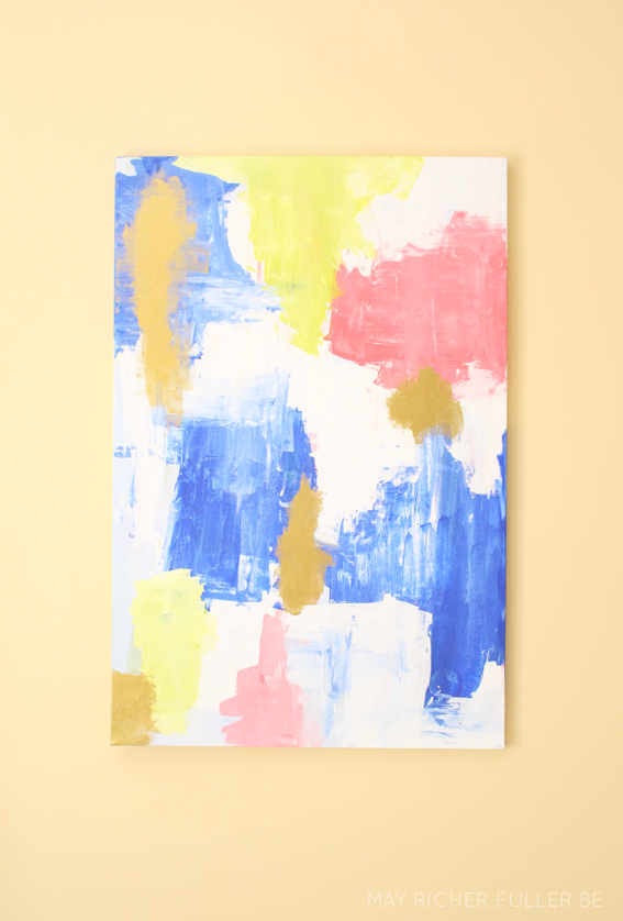
DIY Abstract Art for the Living Room


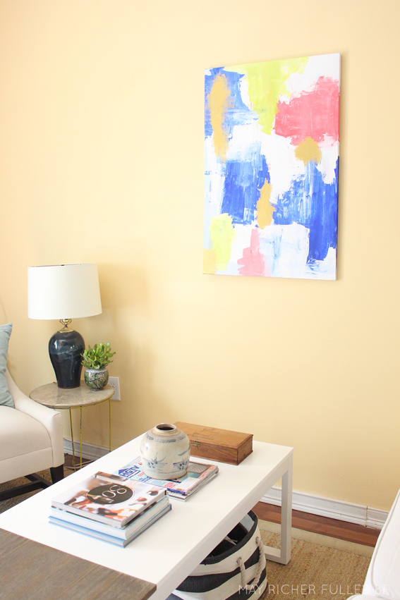
Our living room has been in serious need of some art on the walls. I wanted something BIG to take up some space on that ginormous blank wall, and since I've been wanting to try to DIY some abstract art for oh, like ever, I decided to take this project on myself. (Remember the inspiration I posted about?) I snagged a 24"x36" canvas from Michael's (with a coupon of course!), some cheap-o acrylic paints and a pack of plastic palette knives* (similar) and went to town. I'm really happy with how it turned out!

It took a little while to get the hang of it and I'll admit, I had a first effort that was a major fail. I didn't even take photos of it, it was so sad-looking. But you know what? I just painted right over it and got a final result that I love. I have to thank Julia from Cuckoo 4 Design for her super simple abstract art tutorial...it really helped get me going on this second effort.


I don't have a tutorial for you for this because you know what, I had no idea what I was doing until it was all over! So instead, I'll just show you photos of my new painting hanging in my living room :).


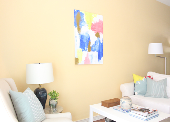
It brought some much needed color and a focal point for this space. What's funny is in some of these pictures, the canvas still looks kind of small on that giant wall, but when you're actually in the room, the size feels perfect.


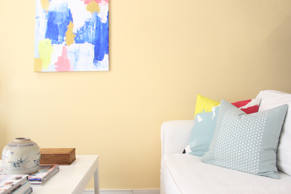
I love the colors I ended up with on the canvas...blues, pinks, greens, white and GOLD! For some reason, it's really hard to photograph metallic paint, but those darker brown areas are gold, promise! ;)


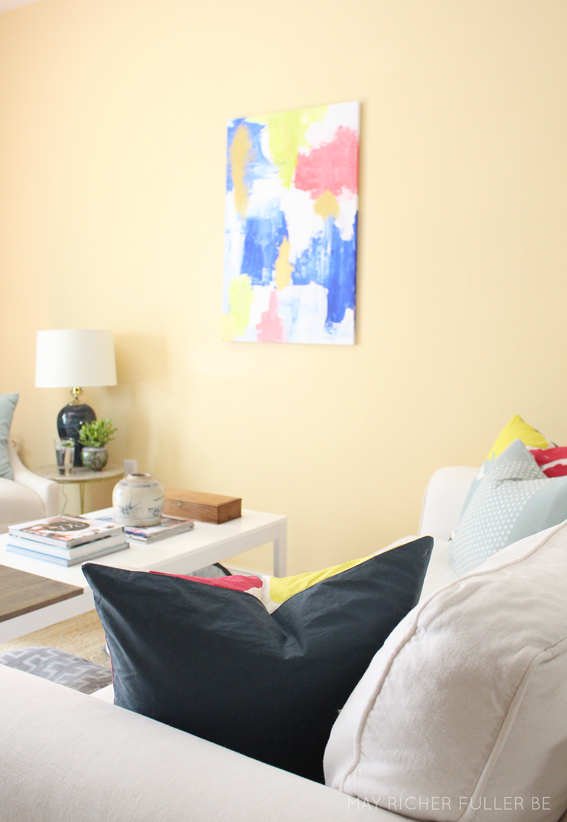
It ties in nicely with the current pillows I have on our couch (which will inevitably change, given my constant itch to redecorate). In case you're wondering, the light blue/white pillows are ones I made from West Elm embroidered dot napkins and the watercolor ones are West Elm Kate Spade Saturday Habanero shams I modified so they'd be throw pillow size.

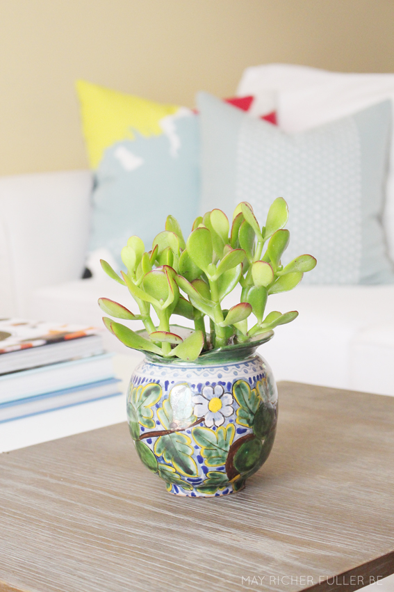
On a side note, can you spot that little plant on the side table by the chair? It's a jade plant I snagged from CVS of all places for $4 and I just love it!


Isn't it cute?


Here's to hoping I can keep it alive!

A closing thought about the art...I don't consider myself to be an artist, and I'm so happy that I decided to try out this abstract art thing anyway. If you're considering trying to do some yourself, DO IT! If it's terrible (like my first one was), just keep messing with it until you like it. If I can do this, so can you!


*denotes an affiliate link


Enjoy what you read today?  Enter your email address below to subscribe to May Richer Fuller Be!


Delivered by FeedBurner

Pin It!

2.18.2015

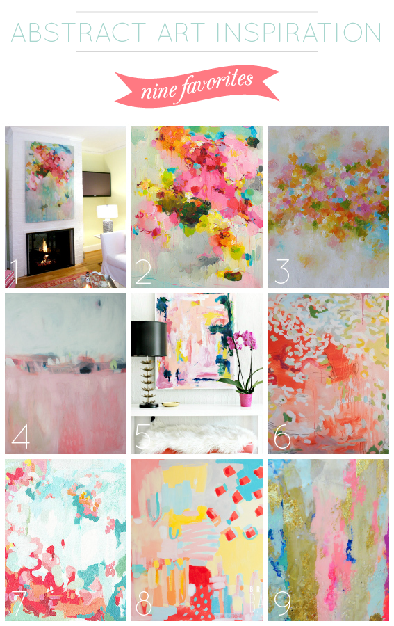
Abstract Art Inspiration {Nine Faves}


| 1 | Bright Bold and Beautiful | 2 | Siiso | 3 | Artbyoak1
| 4 | Lola Donaghue | 5 | Burlap and Lace | 6 | Michelle Armas
| 7 | Cortney North | 8 | Britt Bass | 9 | Blueberry Glitter

I'm definitely on an abstract art kick right now. There's something so fun about this colorful, playful style. I bought a couple of these abstract art-style Kate Spade Saturday for West Elm pillows for our living room and I love the punchy modern vibe they add to our neutral furniture. (I also think the dreariness of winter has me itching to bring color back inside until spring arrives - hopefully sooner than later!)

We've got a big, blank wall in our living room that could really use a big ole piece of art, and I'm thinking maybe, just maybe I could DIY an abstract for it. I've never done anything like that before, but I'm certainly willing to try! *Fingers crossed*

I'm such a visual person that I decided I needed to round up some inspiration before diving into the world of painting. I scoured the internet and found nine paintings that have the vibe I'm going for for the piece. And bonus, if I chicken out on making something myself, at least I have a bunch of resources for pretty art to purchase! Most of these are from Etsy, which has a ton of beautiful, affordable art. 

As I was pulling together this little collection I noticed they all had pretty much the same color palette and several of them have this kind of spotted/dotted situation that I love. I think it's safe to say that I've found my style when it comes to this kind of art!

If you've ever DIY'd anything like these pretty pieces, please send any advice my way! I'm all ears...

Enjoy what you read today?  Enter your email address below to subscribe to May Richer Fuller Be!  Delivered by FeedBurner

Pin It!

1.29.2015

Turning Photos Into Paintings Using Photoshop


It looks like this week is turning into a graphic design-focused one, huh? In case you missed Monday's post, I shared some pretty cute desktop and iPhone wallpapers for the month of February. You can check those out here!

Today I wanted to share a nifty little trick on how to turn your photographs into painterly-like works of art. It's no secret that that look is popular right now. A couple of weeks ago, I ran across this post from The Painted Hive that listed several ways to do just that to your photos. The results she showed were so neat that I decided to try my hand at one of the methods myself. I used Photoshop, which I know not everyone has access to, but if you DO, stop what you're doing right now and go play with some of your photos. It's kind of addicting once you get the hang of it. Read on to see how I gave that farm truck its painterly look.

In Photoshop, under the menu bar titled "Filter" there's an option called "Filter Gallery" that houses all kinds of effects that you can add to photos (most of them are terrible, FYI - yikes!). I tried all of them and my favorite, by far, to get the look I was going for was one called "Palette Knife."

For the tutorial, I'm going to use this landscape photo I took on our trip to Napa Valley a couple of summers ago. It was so beautiful there! Here's the original after I pulled it into Photoshop:


Then I pulled up the Filter Gallery and selected the Palette Knife filter. On the right side, there are three sliders that you can adjust to change the look of the filter. For the photo below, I chose 50 for the stroke size, 3 for the stroke detail and 0 for the softness.


After clicking OK, Photoshop took me back to the normal window with the new filter applied. I played around with the saturation to make the colors deeper and more exaggerated to add to the painterly effect. I love to use the Pioneer Woman's Photoshop actions for this. They're a free download and I use them all the time in my regular photo editing. For this photo, I used "boost" at 50% opacity.


That's it! Photoshop does most of the work for you and you can adjust the settings however you want to get the look you're going for. Here's a side-by-side before and after of the Napa Valley shot above so you can see the difference:


Pretty cool huh? Here are a couple more examples from some other photos - all using the same technique...

The old farm truck (this one might be my fave!):


And some lovely tomatoes from the farmer's market. Can you believe all those colors?


I'm no Photoshop pro, but I had a blast using it to turn these photos into paintings. I'd love to have a few of them printed out on canvases. If you find a good deal on those, this would be an inexpensive way to add some beautiful (and personal!) art to your home.


Enjoy what you read today?  Enter your email address below to subscribe to May Richer Fuller Be!


Delivered by FeedBurner

Pin It!

4.22.2014

DIY Geometic Abstract Art


Tinkering with the gallery wall in the living room has been one of the most enjoyable things I've done with the decor in our apartment. It's easy, inexpensive and low risk to change it up every now and again. I hate that I have to take it down this week for our move! Before that happens though, I decided to try my hand at painting a little geometric abstract art to frame up and add some color to the gallery. I've been wanting to try something like this for awhile, and you know what? I think it turned out to be quite a lovely addition. It's a really easy DIY, so I thought I'd share my process - which isn't much of one! - with you. This is definitely an "anyone can do it" (seriously) project.


Pin It!

2.05.2014

Washington, DC Neighborhood Map Art


I'm really excited to share a new print that's up in my shop with y'all today! It's a piece of typographic art that includes all the neighborhoods of Washington, DC - my current home! My hope this will be the start of a series of prints of many places all across the United States (and maybe the world?). One step at a time... :).

The inspiration for this print came partly from my Richmond Fan District art (also available in the shop!) and partly out of a shirt I bought in St. Barth that had the names of all the beaches and towns on it. I tend to make this kind of art when I'm feeling sentimental about a place, and DC is certainly one of those places. We'll be leaving here in just a few short months to move onto our next adventure (more on that soon). It'll be fun to hang this in our new home as a reminder of the past couple of wonderful years in this city. Our little neighborhood is tucked in there somewhere!
This print is available for instant download in an 8x10 size. It's easy to print at home on 8.5x11 inch card stock, which you can trim to fit an 8x10 frame. It's available in any of the colors you see above, but I can also customize them to be anything you'd like! Just email me at mayricherfullerbe{at}gmail.com or message me on Etsy with your idea.

I printed one myself in the green and blue colorway and added it to my gallery wall. Y'all know I like to switch that art up all the time!


I also love making custom art, so if you'd like one of these that's in the shape of your hometown, state or favorite place, let me know! And if you know anyone who loves DC, please send them on over to my shop - I'd love to get the word out on this print.


Do y'all have any art that represents your hometown or where you currently live? Are you as sentimental about leaving a place as I am when you move?


Pin It!

9.16.2013

Typographic Chalkboard Art for CHAT


Recently, Caitlin, a friend of mine, asked me if I would consider creating some typographic art for CHAT, the non-profit organization she works for. I jumped at the opportunity - not only because I love graphic design projects, but also because I (and my husband) wholeheartedly love and support this organization. CHAT is doing some pretty awesome stuff in the inner-city of Richmond, Virginia and I'm glad I could be a part of it in a small way by creating some art for one of its walls :).

So what's CHAT, you might ask? Well first off, CHAT's an acronym that stands for Church Hill Activities and Tutoring. It's a Christian community development organization that seeks to impact the lives of youth in the inner-city neighborhood called Church Hill. They seek to be great neighbors to the surrounding community and invite members of that community to do the same. Practically, this includes running a school (Churchill Academy) for at-risk students and a tutoring program for kids in homes all over the neighborhood, as well as other community events. Providing excellent education is one of their biggest priorities.

It goes beyond simply educating kids though. I think Percy Strickland, founder and CEO, described the ultimate goal of CHAT best when he said, "Our hope is that by making the residents of our inner-city community a part of our family that God will be able to transform hearts and in doing so change the harsh reality of the urban environment."

Transforming hearts to transform communities. Pretty neat, huh?

So I think you can see why I was so excited to have the opportunity to create something awesome for them. Caitlin asked me to create three large pieces using some key phrases from their vision statement: "opening homes," "transforming lives," and "rebuilding communities."

After some brainstorming and looking at some inspiration photos, my friend and I decided that chalkboard-style art would be perfect. Since so much of what CHAT does revolves around education, going for this look would be pretty fitting, right? And it doesn't hurt that the chalkboard look is quite popular right now. These three large pieces will go up on a huge wall in one of the houses where hundreds of kids come through each year for tutoring and mentoring. These three phrases will literally be in their faces each day, reminding them (and the staff and volunteers) that this is why CHAT exists. I love that.

Here are the pieces:


It was fun putting my creative touch on those phrases to bring them to life. To make them, I created a chalkboard background in Illustrator first and then added the phrases in fun fonts and shapes. Each one is unique, but since the typefaces are white and the backgrounds are the same, they compliment one another nicely. They'll go in large poster size frames from IKEA and then up on the wall in the house.

In case you're font-crazy like me, and are curious about the typefaces I used, they are (from top to bottom): Ostrich Sans, Return to Sender, Poplar Std Black, Kraft Nine, Scribble Box Demo and Champagne and Limousines. They're all free fonts, but make sure you check on the licensing agreements for each before you use them for anything but personal use.

Since I downloaded a bunch of new fonts for this project (yippee!) and played around with several before deciding on the ones above, I decided I'd do a round up of my favorite chalkboard-appropriate fonts for you here on the blog. That'll be coming tomorrow, so make sure you come back then :).

I'm so pleased with the way this project turned out. I hope to show you a "finished" photo once they're up in their new home!

P.S. If hearing about this organization struck a chord in you or if you have a heart for transforming communities and the lives of at-risk youth in the inner city, learn more about CHAT here. They're a non-profit solely depending on the generosity of others. God has been faithful to them in so many ways, and I know they'd appreciate your support through prayer or donations! If you'd like to find out how you can help, head over here

P.P.S. If you're in the market for graphic design services and you like what see here, I'd love to talk to you about your project and needs. Shoot me an email at mayricherfullerbe{at}gmail.com and we can chat! 


---------


Pin It!
Related Posts Plugin for WordPress, Blogger...
Blogging tips