Showing posts with label tutorial. Show all posts

4.20.2016

Make It: DIY Sputnik-Style Light Fixture

*Psst! Thanks to everyone who entered Mix & Match Design Company's e-design giveaway! I'm hard at work going through the submissions and it's going to be SO hard to choose just one. Y'all have such awesome homes and I can't wait to work with one of you!


If you saw my Instagram from last week, you'll know I've been working on a fun little DIY light fixture for my office. It's been way too long since I've DIY'd something and shared it here, so I figured it was high time to get 'er done to show y'all!

https://www.instagram.com/p/BEHbwwQyWE7/?taken-by=mayricherfullerbe

I've been a fan of Sputnik-style light fixtures for awhile now. They're modern, kinda funky and fixtures with exposed bulbs are definitely "in" right now. I needed a ceiling fixture to replace a sad-looking fan in my office, but wasn't ready to commit to spending the big bucks on a new fixture just yet.

Then on Pinterest (of course!) I spotted Little Green Notebook's DIY branch light and I thought a variation on that would be the perfect thing! I made a couple of modifications to make it work for my space and the step-by-step is below in case you want to make one yourself.

Supplies needed: (* Denotes an affiliate link. That means I get a tiny commission when you purchase through my link. There's no cost to you - thanks for supporting this little blog. :))


Putting this light together is a little bit like building with legos - it's super straightforward and you really can't mess up. You get to be as creative as you want!

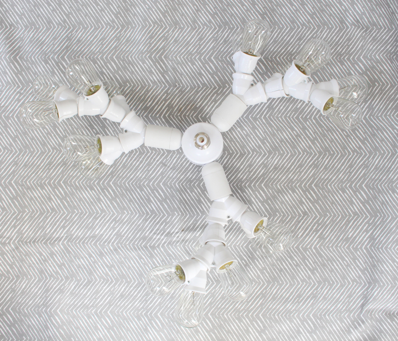
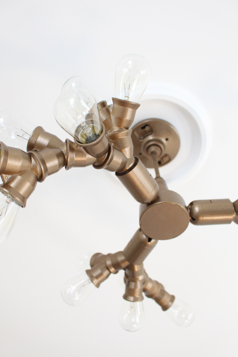
Start with the 3-in-1 socket adapter and screw a Y socket splitter into each end.


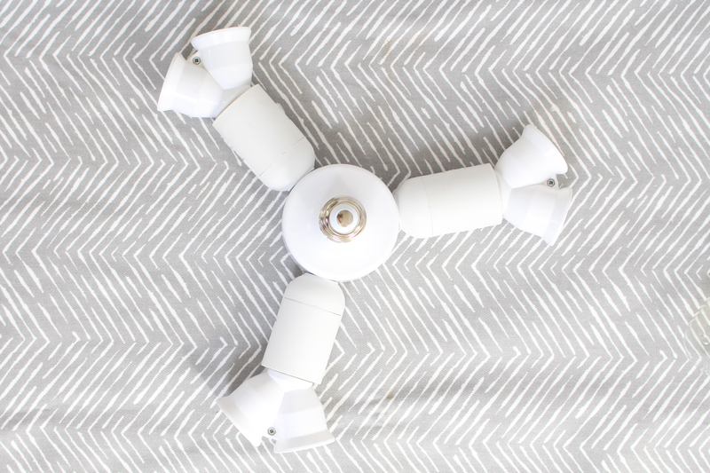
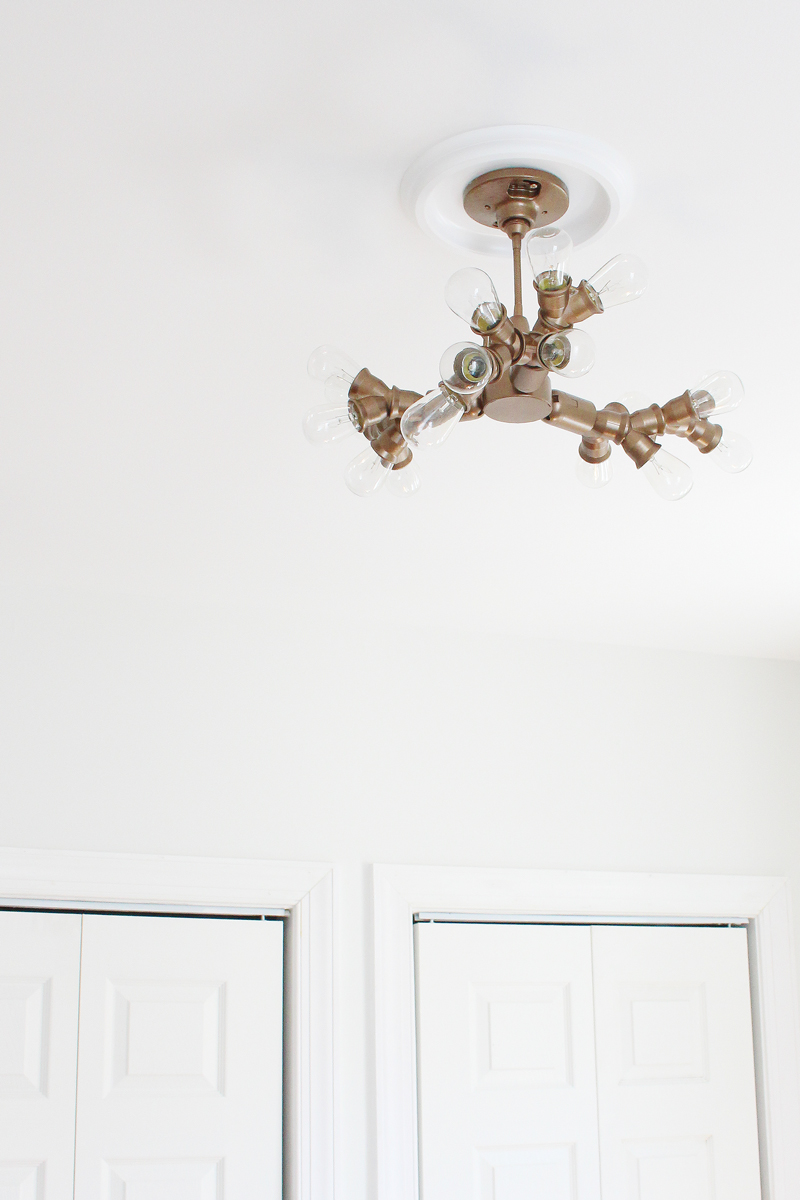
Keep adding additional Y socket splitters to open ends until you get to the look you want. I ended up using 15 and gave it a pretty symmetrical look. What can I say - I like balance!


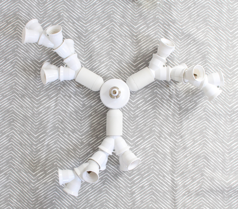
Once you finish attaching the Y splitters in a pattern you like, add lightbulbs to the remaining open sockets. You'll take these out to paint the fixture (unless you want to leave it white, which is pretty too!), but I liked seeing how it would look in its final form before heading to that step.


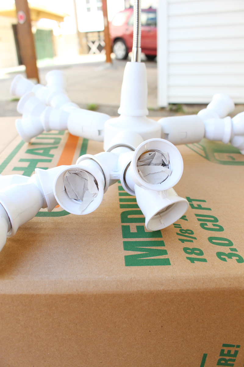
Finally, screw on the flexible extender and outlet box mount to finish the assembly before painting. Here it is before I got my spray paint on.


Before taking it out to paint, I installed it temporarily to make sure I was really happy with the scale and amount of light it gave out. My office isn't huge, but I found that with my original design, it wasn't quite bright enough. No big deal - I just added a few more Y splitters and bulbs to increase the amount of light.


Onto the painting!

But, here's one other pre-painting step that's very important!! Make sure to stuff the sockets with some newspaper to protect the light bulb contacts. It would be a shame to finish painting, screw in those bulbs, and then have the fixture not work!


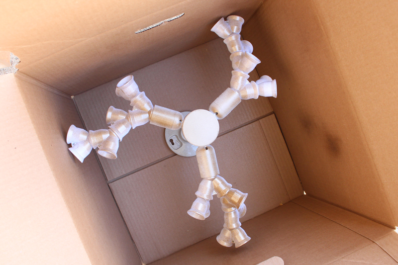
I decided to spray my fixture metallic coppery-gold and since it was a tricky fixture to paint, I used a cardboard box as a makeshift paint shed - it worked perfectly to prevent overspray from getting on the concrete and helped it stand up for painting and drying purposes. I made sure to use multiple light and even coats and rotated the fixture several times to make sure all surfaces were well-covered.


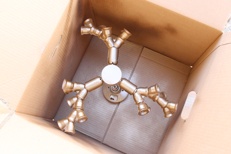
(Side note: for those who are wondering about priming prior to spraying the metallic paint...I skipped that step. Should I have? Probably not, but since this fixture is installed on the ceiling, durability isn't an issue and I decided to be a total rebel and not prime. Many of these pieces are plastic though, so it will chip if you scratch at it. So far so good though!)

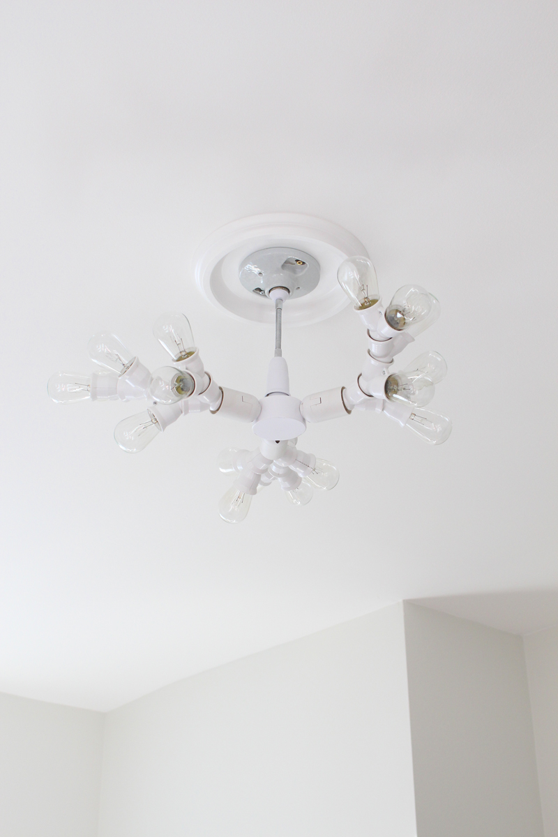
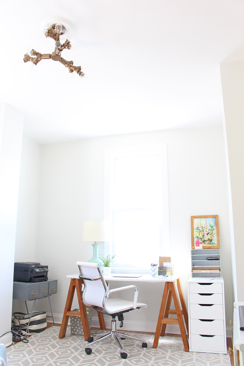
Now let's get to the good part - seeing it after installation! (Outlet mount boxes are super easy to install - just follow the directions in the box. If you don't feel comfortable with that, definitely hire an electrician!)


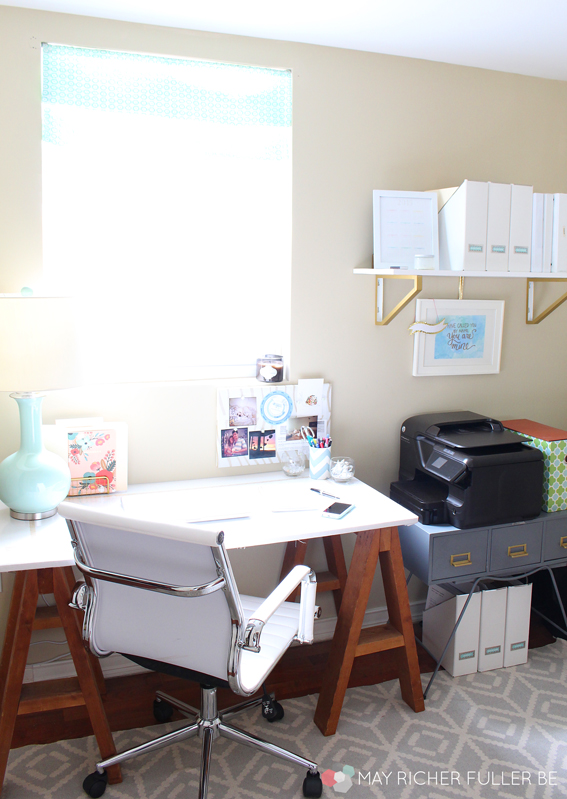
I added a ceiling medallion to really finish it off around the outlet box and I think it looks great. Here's how it looks with my office area in the background:


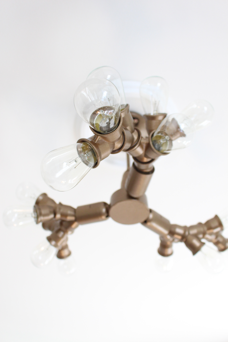
Love all those fun bulbs!


I'm thrilled with how it turned out. It brings such unexpected personality to the room!


Hooray for successful DIY projects! What have you been DIYing lately?


Enjoy what you read today?  Enter your email address below to subscribe to May Richer Fuller Be!  Delivered by FeedBurner

Pin It!

3.25.2016

DIY Large Scale Art & A Few Styling Tips

(Note: Modern Masters provided the Pale Gold metallic paint for this project, but I was not otherwise compensated. All opinions are my own, as always!)

Art. It's a key part of making a room look finished, adds style and personality, and can unfortunately cost a pretty penny for good, quality pieces. I'm all about investing in beautiful pieces that you love, but sometimes that's just not in the budget.

Enter DIY art: the affordable alternative that lets you flex your creative muscles as well! Making art can be totally fun and therapeutic even if you're not what you'd call, ahem, artistic. You can make some beautiful stuff for your home. Promise.

I talked about a bunch of options for DIY-able art here, so if you're ready to take a project like this on, try my idea below or check out the other ones in that post.

In our dining room update earlier this week, I mentioned that I created these two pieces of large scale art for one of the big ole blank walls in there. Here's where they are:


(*Side note: ugh, I just can't handle that brass chandelier - it's high on the list to replace!)

Let's take a closer look at those two pieces. They're super simple to make.


Here are the supplies I used if you'd like to try your hand at making some of your own:
  • Royal blue acrylic craft paint
  • Modern Masters Pale Gold paint from their Metallic Paint Collection
  • Craft paint brush - I used a fat round one
  • White poster board - yep, nothing fancy here! If you mess up, it'll only cost you about 25 cents to start over.
  • IKEA Ribba frame - these are the 24"x35 3/4" size and the poster board fits perfectly in it
I decided to make two patterns: one "U" pattern and one "V" pattern. I sketched these out on a smaller scale first to make sure I liked them and then just went right at it. I chose blue as the predominant color and gold as an accent color, adding it in randomly when it felt right. I was inspired by the mud cloth and shibori looks that are so popular right now and wanted the patterns to look more on the imperfect side. I think I achieved that! 

Plus, perfection is overrated sometimes. ;)

After the paint dried, I popped them in the frames, securing them to the mat with washi tape at each corner.


I like how these two complement each other in color and style, but that the patterns are still distinct from one another. Also, that Modern Masters Pale Gold paint was the perfect metallic touch - it ties the art into the nearby kitchen pendants and the overhead lighting in the living room, all of which helps make these rooms look cohesive, but not matchy matchy. The gold paint is such a dream to work with: it goes on smoothly and is a true metallic with beautiful reflective qualities. Open floor plans can be tricky sometimes!

I had a lot of fun figuring out how to style these pieces for photos - styling is always a trial and error process for me - and thought I'd share my process as a fun little bonus for this post! I even made a gif for it - I think that's a first for MRFB! If you can't see the gif, just scroll down. The photos are there individually too.


I started with two stacked stools from our bar area and topped them with a potted succulent (jade)...


Added a second potted succulent...


Brought in a dining room chair...


Then a pillow...


And finally, one more plant for good measure.


I'm not an expert styler by any means, but I've learned a few things that are important to make vignette look great:

  1. Always include something living - either a plant or flowers.
  2. Vary the textures. Here I've mixed in metal, wood and soft fabrics.
  3. Gather items in groups of threes.
  4. Mix up the height of objects.


I hope you'll try some DIY art! It's a fun project that can totally transform a space.

Have a great weekend, y'all!

Enjoy what you read today?  Enter your email address below to subscribe to May Richer Fuller Be!  Delivered by FeedBurner

Pin It!

9.17.2015

DIY Easy Faux Roman Shade


A little over a month ago, I had the pleasure of guest posting for Carrie at Lovely Etc. while she was spending time with her new little baby boy. I love guest posting and Carrie's blog is awesome, so it was a win-win! In case you missed that post, I thought I'd share my project - an easy DIY faux roman shade - over here too.

I work from home for my day job in healthcare, so that means I spend about eight hours a day in my office. Over the year or so we've lived here, I've had a blast turning it into a space that I love. It's light and bright - my favorite combination! And while bright is almost always a good thing, for a couple of hours in the afternoon the sun shines so brightly that it's blinding. I was in desperate need of a window treatment that would filter that bright sunlight, but not take away too much of that precious natural light from the one window I have in there.

To see more of my office, check out this post!

Since my desk sits under that window, traditional full-length curtains weren't an option, so I decided to DIY a simple faux roman shade for it. Y'all, this was such an easy project - and it's renter friendly for those of you in that category! This faux roman shade is perfect for a window where you don't necessarily need privacy, but do need to block some light. You'll see why in a minute.

Here are the supplies you'll need to make a faux roman shade:
Step 1: Hem your fabric on three sides so that it fits snugly inside the width and height of your window. I used a sewing machine, but if you're sewing-averse (or don't have one), iron on hem tape works great too. 

For the fourth side, create a small pocket that is slightly larger than the diameter of your small tension rod. You can see the pocket I made below on the right side of this photo and the next photo below. 


As a side note, I picked this piece of fabric up from the remnant bin at one of my favorite local fabric stores. The remnant bin is a great way to get a pretty piece of fabric for a deep discount for small projects like this!

Step 2: Lay your fabric down and create the folds for the roman shade. I didn't measure these - I eyeballed it and created two folds for the look I wanted. Adjust the folds according to how much of the window you want to cover in "default mode." Remember, this faux shade only has two settings - fully up or fully down - so plan your folds accordingly!


Step 3: While the fabric is laid flat and folded, take your adhesive velcro squares and stick them to the inside tops of the folds along the edges first (make sure you stick them in the areas that hold the weight of the folds!). These Velcro squares keep the folds in place once it's hanging up. Then add two or three more squares across the middle areas to support the rest of the width of the fabric folds. I used four squares total across each fold and that holds up the shade beautifully. The Velcro packaging says the adhesive is not made for fabric, but I decided to throw caution to the wind and try it ;). It's working great so far! If I ever feel like the adhesive isn't strong enough, I'll just add a dab or two of fabric glue to make 'em stick. (**Update! The velcro adhesive didn't end up being strong enough for the fabric, so I just dabbed a little fabric glue on them and they're good to go. Nothing like a little trial and error to get it right!)

I realize it's hard to understand where to attach the velcro in words, but here's one example of where I attached mine - hope this helps you visualize it! This is the view from the backside of the fabric.


Step 4: Insert your small tension rod and hang your pretty new faux roman shade! Here's my finished project:


I love how this turned out. It's perfect for my needs (and I hope a few of yours as well!) and it's simple - no fancy lining and sewing is optional! I used Velcro so that I'd have the ability to pull down the shade if I need to, but that's a rare need for my situation. Nearly all of the time it'll stay just like you see in the photo above. This project only took me about an hour, which was time well-spent for some much needed function and style for my naked window :). I hope y'all will try this project out next time you need a roman shade as a window treatment!


If you enjoyed this project, check out a few more of my favorite DIYs!

Pin It!

6.22.2015

Living Room Fireplace Wall Makeover {Take Two}


Remember how back in the fall I gave this lovely brown tile wall a makeover with (temporary) headboard wallpaper? Well, it turned out that that idea was great in theory, but it turned out to be an epic fail. No matter what I tried, the adhesive just never held well and the wallpaper started falling down in strips. Not ideal.

So back to the drawing board I went. One of my original ideas was contact paper, but I never jumped on it until I discovered the beautiful options Design Your Wall had on their website. I posted about my finds on Facebook and soon after got an email from Dennia, the representative for d-c-fix (who is the contact paper supplier for Design Your Wall), asking if we might be able to work together. My answer? Why yes! I believe we can :).

A big thanks to d-c-fix for helping me solve this problem wall once and for all!

I chose the Whitewood Matte contact paper, which has a very subtle wood grain look to it. This is not your run of the mill contact paper, y'all, it's super high quality. It's made in Germany, so you know they've engineered this product beautifully!

Dennia was kind enough to send me a simple installation kit along with the instructions for how to apply it.


I loved having the smoother tool and razor handy. No need to provide my own special tools. (If you're looking for the installation kit on the Design Your Wall website, you won't find it yet - it's hopefully coming soon!) Those two things, plus a metal-edge ruler were all I needed to install the product.

First, I wiped down the tile with Windex to ensure there was no dust or grime that would mess with the adhesive, then I went to town installing it vertically, one sheet at a time, all the way across the wall. I followed the instructions on the packaging and found it to be very easy to do - using the smoother tool made it so I really didn't have issues with bubbles. I did have to reposition pieces a couple of times to make them straight, but that was an easy fix. I left some overhang on the top and bottom so I could trim it precisely at the edges so it would look flush. On Dennia's advice, I also overlapped the pieces a little bit at the seams so there wouldn't be any gaps where the pieces joined together.


When it came to trimming off the excess, I found that the easiest way to keep the razor going in a straight line was to press a metal-edge ruler against the wall and run the razor blade in-between.

Then after that installation, I was left with a beautiful white wall with a subtle wood grain texture. I think it's fabulous!


I also took down our big, black box of a TV and replaced it with a vintage map of Martha's Vineyard. I'm actually thinking about leaving it there and figuring out another place for the TV since we hardly ever watch it. It's just kind of an eyesore with all these cords hanging down the side...I'd much rather look at pretty art instead.


The contact paper brightens up the room so much and frames that fireplace nicely. I know it's really difficult to see the pretty wood grain texture in photos, but trust me, it's there. :) I choose to leave the tile alone around the fireplace since it's wood-burning and I don't know how that adhesive would react to heat.

I'm thrilled with the quality and look of this contact paper from d-c-fix and I would definitely recommend it to anyone who is in the market - renters especially! It's such a great non-permanent solution that can really transform a room. I've got about half a roll of contact paper left and now I'm thinking about other places I can use it in our home. Time to do some brainstorming!


*I was generously provided with a roll of contact paper from d-c-fix for this project. It was a pleasure collaborating with them, but as always, my good opinion of them is all my own! See the footer of this blog for my full disclosure.


Enjoy what you read today?  Enter your email address below to subscribe to May Richer Fuller Be!


Delivered by FeedBurner

Pin It!

6.09.2015

DIY Upholstered Twin Headboards {The Easy Way!}


I've got an update for you on the twin bedroom makeover at the river house! Little by little, pieces have been arriving for the room and today I've got an update on the DIY I'm doing for it: upholstered headboards. This is my third crack (and fourth I guess, since there are two twin beds in this room) at upholstering a headboard and this time I cheated. Yep, that's right, I took the easy way and it was SO worth it!

Want to know the secret behind this DIY? Purchasing an inexpensive, pre-made upholstered headboard from...you'll never guess...Wal-mart, and reupholstering it in a pretty, bold fabric. Y'all, this is the simplest upholstery project ever. If you've always wanted to DIY an upholstered headboard, but have been fearful of the whole process of building the frame and then adding foam, batting and fabric, this project is for YOU.

Supplies you'll need:

Here's what the upholstered headboard looks like right out of the box:


Boring and white and perfect for this project. At $59 (crazy, right?), this pre-made headboard was pretty much the same price as the wood, foam and batting I would've purchased to make a headboard from scratch, so buying it was a no brainer. The fabric is really cheap-looking polyester, but it doesn't matter because I covered it right up with pretty fabric! 

Upholstering this headboard was really straightforward. I started by placing the headboard face down on my fabric and lining it up on the pattern so it was straight and centered. Since this fabric has a repeat both vertically and horizontally, it was just a matter of shifting it around until it looked right.


Then I pulled the fabric from the edges onto the back of the headboard and added a single staple at 12 o'clock, 3 o'clock, 6 o'clock and 9 o'clock. 


I turned the headboard over briefly after adding those four staples to make sure the fabric still looked centered and straight from the front, then continued to pull the fabric taut and staple all the way around.

Corners can be a little tricky, but the two-fold method I use works beautifully and looks very crisp from the front. Here's how I do it:

First I grabbed the loose fabric right at the corner and folded it so that the excess is on the underside. I pulled that piece tight and laid it down flat at a 45 degree angle.


Next, while holding down that piece, I grabbed the remaining loose fabric and folded it under so that the fold at the top edge was parallel to the fabric that's already stapled down. I then laid that down flat on the piece I was holding at a 45 degree angle. I used one hand to hold it all together while I used the other to add a few staples to keep everything in place.


These are the key staple placements to keep those folds in place:


It's kind of like wrapping a present, but you have to mess with the fabric a little bit to get it to lay smooth and flat.

Then I trimmed the excess fabric off from the edges, attached the legs and voila, I was done! 


Hello pretty headboard!


I love how they turned out. It was definitely worth it to take the shortcut with this project. The headboards really will be the focal point of the room with that zippy, fun fabric. Each one took maybe 30-45 minutes to do, so that means I whipped out two upholstered headboards in only a couple of hours - that's a winner in my DIY book! Even if you're not a DIYer, I encourage you to try this method if you're in the market for an inexpensive upholstered headboard (each one cost approximately $75 total). If you're feeling more adventurous and would like to build the frame yourself, check out my post on how to do that here.

I'll be putting the twin bedroom together this week. I can't wait to share the results with you soon!


Curious about the before photos and design plan for this room? Check out the intro post for details!


*Denotes affiliate link. When you make a purchase through that link, May Richer Fuller Be earns a small commission at no cost to you. Thanks for supporting this blog in that way!

Enjoy what you read today?  Enter your email address below to subscribe to May Richer Fuller Be!


Delivered by FeedBurner

Pin It!
Related Posts Plugin for WordPress, Blogger...
Blogging tips