Showing posts with label paint. Show all posts

3.25.2016

DIY Large Scale Art & A Few Styling Tips

(Note: Modern Masters provided the Pale Gold metallic paint for this project, but I was not otherwise compensated. All opinions are my own, as always!)

Art. It's a key part of making a room look finished, adds style and personality, and can unfortunately cost a pretty penny for good, quality pieces. I'm all about investing in beautiful pieces that you love, but sometimes that's just not in the budget.

Enter DIY art: the affordable alternative that lets you flex your creative muscles as well! Making art can be totally fun and therapeutic even if you're not what you'd call, ahem, artistic. You can make some beautiful stuff for your home. Promise.

I talked about a bunch of options for DIY-able art here, so if you're ready to take a project like this on, try my idea below or check out the other ones in that post.

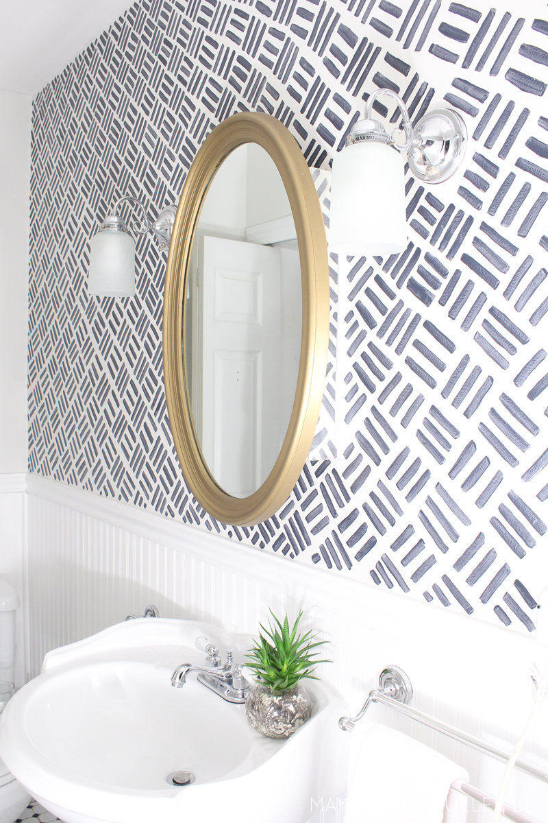
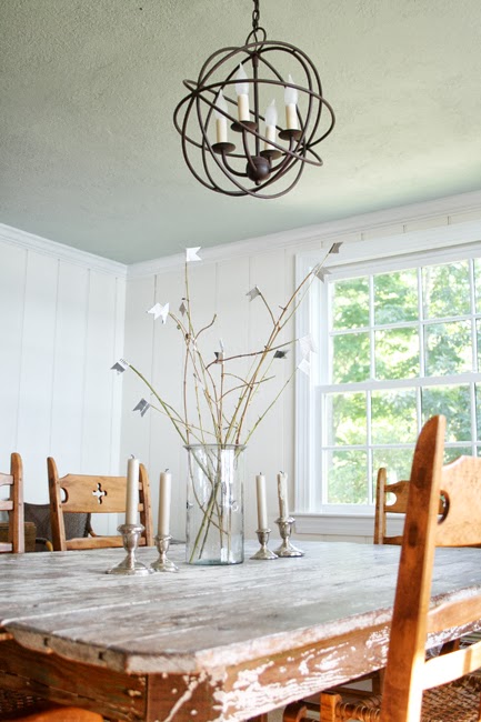
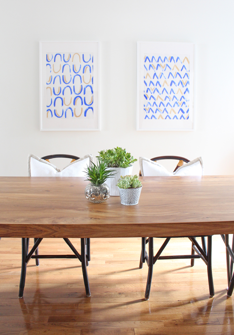
In our dining room update earlier this week, I mentioned that I created these two pieces of large scale art for one of the big ole blank walls in there. Here's where they are:


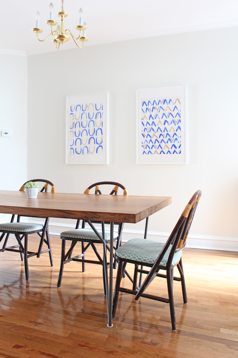
(*Side note: ugh, I just can't handle that brass chandelier - it's high on the list to replace!)

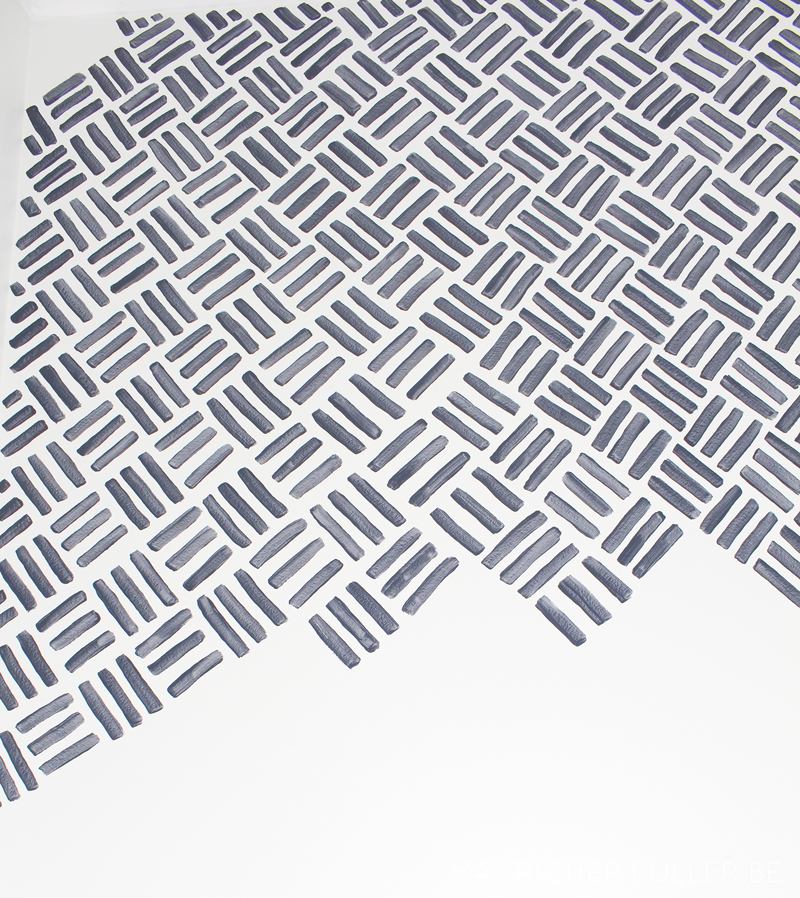
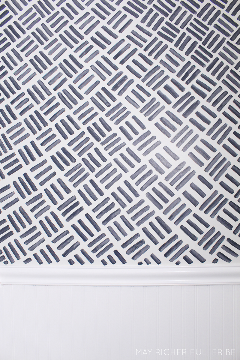
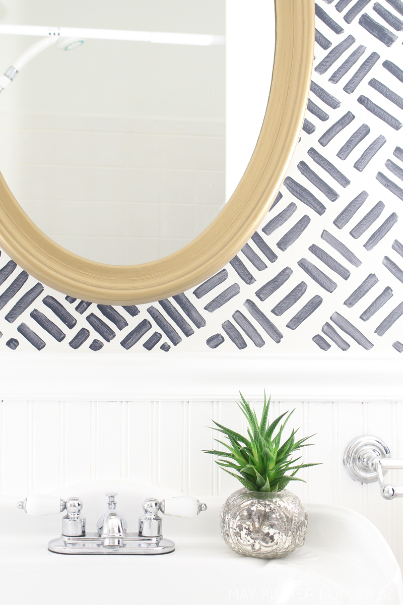
Let's take a closer look at those two pieces. They're super simple to make.


Here are the supplies I used if you'd like to try your hand at making some of your own:
  • Royal blue acrylic craft paint
  • Modern Masters Pale Gold paint from their Metallic Paint Collection
  • Craft paint brush - I used a fat round one
  • White poster board - yep, nothing fancy here! If you mess up, it'll only cost you about 25 cents to start over.
  • IKEA Ribba frame - these are the 24"x35 3/4" size and the poster board fits perfectly in it
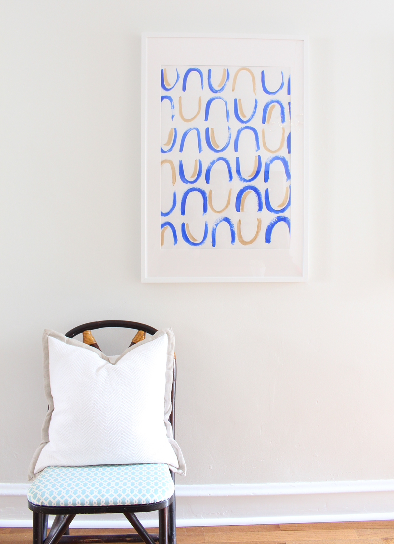
I decided to make two patterns: one "U" pattern and one "V" pattern. I sketched these out on a smaller scale first to make sure I liked them and then just went right at it. I chose blue as the predominant color and gold as an accent color, adding it in randomly when it felt right. I was inspired by the mud cloth and shibori looks that are so popular right now and wanted the patterns to look more on the imperfect side. I think I achieved that! 

Plus, perfection is overrated sometimes. ;)

After the paint dried, I popped them in the frames, securing them to the mat with washi tape at each corner.


I like how these two complement each other in color and style, but that the patterns are still distinct from one another. Also, that Modern Masters Pale Gold paint was the perfect metallic touch - it ties the art into the nearby kitchen pendants and the overhead lighting in the living room, all of which helps make these rooms look cohesive, but not matchy matchy. The gold paint is such a dream to work with: it goes on smoothly and is a true metallic with beautiful reflective qualities. Open floor plans can be tricky sometimes!

I had a lot of fun figuring out how to style these pieces for photos - styling is always a trial and error process for me - and thought I'd share my process as a fun little bonus for this post! I even made a gif for it - I think that's a first for MRFB! If you can't see the gif, just scroll down. The photos are there individually too.


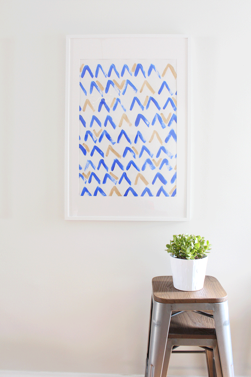
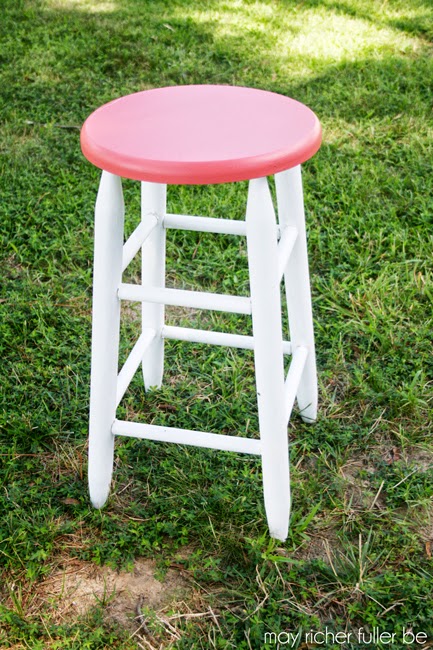
I started with two stacked stools from our bar area and topped them with a potted succulent (jade)...


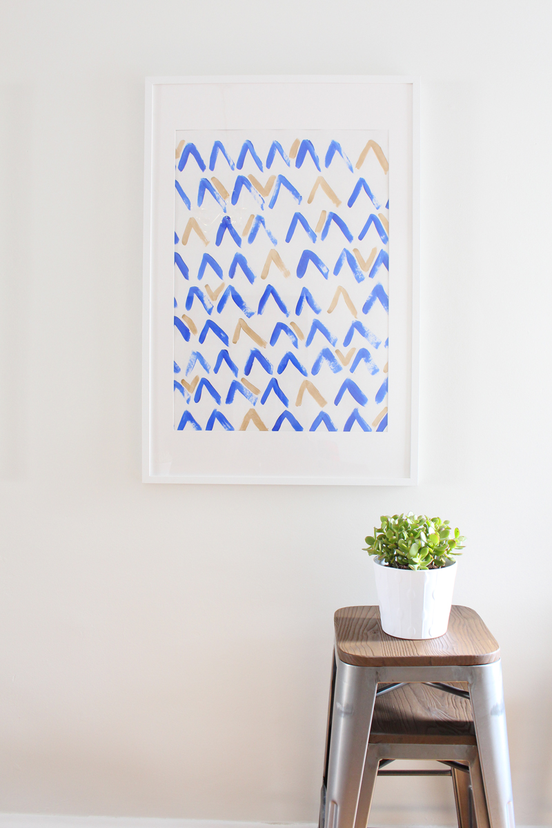
Added a second potted succulent...


Brought in a dining room chair...


Then a pillow...


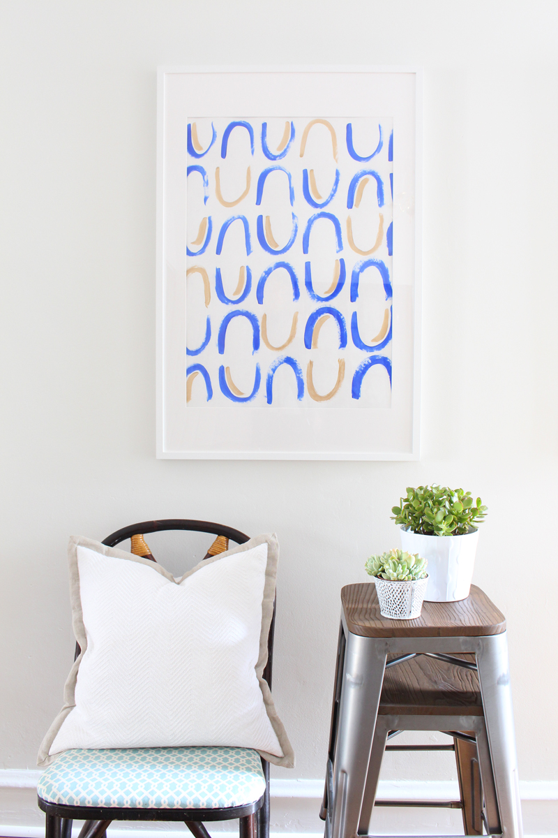
And finally, one more plant for good measure.


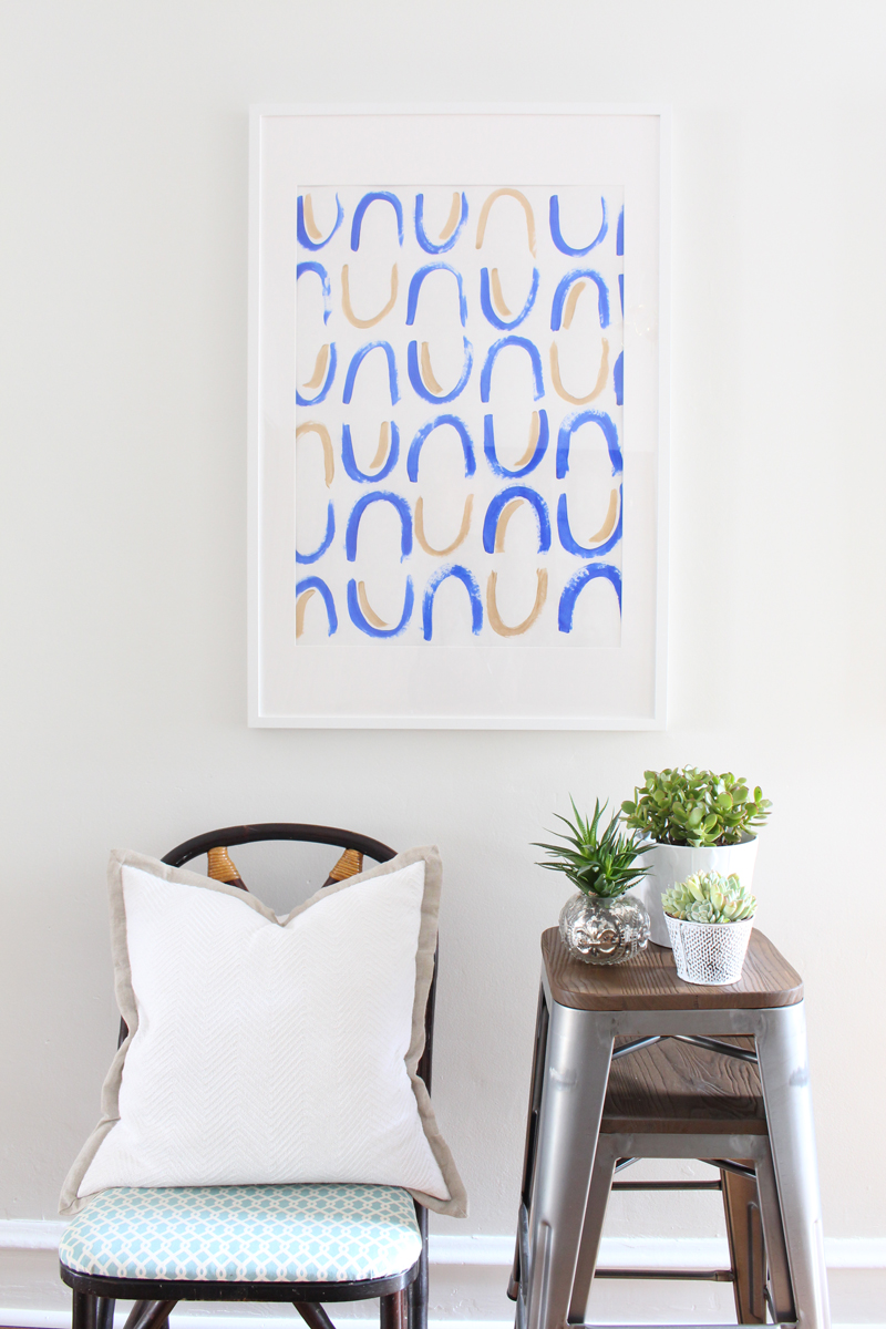
I'm not an expert styler by any means, but I've learned a few things that are important to make vignette look great:

  1. Always include something living - either a plant or flowers.
  2. Vary the textures. Here I've mixed in metal, wood and soft fabrics.
  3. Gather items in groups of threes.
  4. Mix up the height of objects.


I hope you'll try some DIY art! It's a fun project that can totally transform a space.

Have a great weekend, y'all!

Enjoy what you read today?  Enter your email address below to subscribe to May Richer Fuller Be!  Delivered by FeedBurner

Pin It!

3.07.2016

Small Bathroom Makeover {The Full Before & After}


Last week I shared a little bit of the makeover I gave our small bathroom and I'm back to give you the full details of what I did - all the way from the beginning. I feel like you need to see the true before photos to really appreciate how it looks now. :)

In case you haven't been around since we started renovating out little row house in Philadelphia back in the fall, let me show you where we started with this bathroom beginning with a real estate listing photo:


Helloooo purple! Two shades of purple, in fact. This was the actual photo the real estate agent put in the listing (crooked, poorly lit and just so much stuff). They certainly weren't doing the house any favors here, but thankfully we were able to see past all that and realize that the bones were good - it just needed some serious help in the paint and decluttering department.

Let's move on to how it looked once all the previous owner's stuff was gone:


Please forgive the crazy lighting here and the other junk. This was taken before I figured out how to shoot this tiny, windowless room and right before I was about to paint! :)

The first step in this bathroom makeover was getting rid of all that purple. I gave it all a coat of Kilz primer then two coats of regular paint: Behr Ultra Pure White on the beadboard and Benjamin Moore Winter White on the walls. I also took down the glass shelf by the mirror, the small accordion vanity mirror and the two towel rings on the linen closet doors. I felt like all of those things were making an already small room feel cluttered.


Again, the lighting in this photo is terrible! Oh well - can't worry about that now that it's in the past. Even with the terrible lighting, it was looking so much better already.

The next step was to paint the boring white medicine cabinet mirror a beautiful matte metallic brass from Modern Masters. I talked all about that in last week's post, so head over there if you'd like more details.

This mirror just blended right into the wall when it was white...


Then boom. Brass. Now it's a focal point!


After the mirror was done, it was time to really make that wall a showstopper with some pattern. I talked a lot about wanting to use wallpaper in here, but in the end, I realized I could get the look I wanted for a fraction of the price using paint. Plus, with paint there's no need to worry about humidity issues that can sometimes be a problem with wallpaper in bathrooms.

I picked up a sample pot of paint at Lowe's in Valspar's Gotham Gray. Depending on the light, it looks like a charcoal gray with some blue in it or nearly black. I love love the color.

I sketched out some patterns on a piece of poster board and ended up with a simple repeating hash pattern (is that what you'd call it?). It's almost like a basketweave. I decided to throw caution to the wind and freehanded it all the way across the wall. It took a couple of afternoons to finish, but was surprisingly therapeutic. Here it is in progress:


And here's a finished section:


Now let's get to the good stuff and see the whole thing!


I'm thrilled with how well the pattern plays with the brass mirror. In an all white room, this was just the pop it needed!

The other small change I made had to do with the sconces. They're not my favorite, but purchasing new ones wasn't on my list for now, so I decided to get creative. Here's a closeup of one of them pre-update:


I realized that I could swap out the glass shades since they were a standard size, so I snagged two of these more modern ones from Lowe's while I was picking up my sample pot of paint. (The online photo does not do them justice - I'm glad I saw them in person first!) When I got home, I flipped the sconces upside down and put the new glass shades on. I like them so much more now!


These small details can make all the difference, can't they?

So that's full story behind our sub-$50 bathroom makeover. I'm thrilled with how it looks and it makes me so happy to go in there now. Three cheers for the power of paint and a little creative thinking!


Enjoy what you read today?  Enter your email address below to subscribe to May Richer Fuller Be!  Delivered by FeedBurner

Pin It!

12.07.2015

The Power of Paint: Bathroom Edition

The power of paint is real, my friends.
When we bought our house, the only bathroom in it was purple (remember the real estate photos?). And not only that, it was two shades of purple. While purple can be a lovely color, it's not my fave, and in this case it made the bathroom feel small. Plus, those colors are just so...how do I say it? In your face.

I finally got a chance to slap a few coats of paint on over the past week and I am thrilled and amazed at how much it changed this small room. I wanted to share this mini-transformation with y'all today to show you how big of an impact it had! Besides painting, the only other thing I did was take down the accordion wall mirror and exceptionally high-mounted shelf. Everything else is the same. There are other things I'd love to change in here over time, but paint was priority numero uno for now.

Before: (like how I didn't even clean up for y'all? Ha!)


After:


Both the walls and bead board got a coat of Behr primer to tone down that purple, then they got two coats of finish paint. The wall color is Benjamin Moore Winter White (color matched to Behr) and it's a tad grayer than the color in the photos above. I'm having a hard time photographing this space because there's no natural light, but I'm working on it! The bead board color is Behr Ultra Pure White. That's the same color as the trim in the rest of the house as well. 

The first few times I walked into the bathroom after I painted it, I almost laughed at how bright it was - it was practically blinding! I'm not sold on keeping the wall color Winter White because it reads a little more green than I'd like in this room, but it's what we painted the rest of the walls with and I wasn't ready to make a color decision in here yet. I'm open to suggestions!

If this was your bathroom, what color would you paint the walls? 

So that's a little #phillyreno update for you today. :) Follow me on Instagram (@mayricherfullerbe) for more sneak peeks and in-betweens!


Enjoy what you read today?  Enter your email address below to subscribe to May Richer Fuller Be!  Delivered by FeedBurner

Pin It!

10.22.2014

Thinking About: Painting the First Floor White

Sometimes I like to use this blog as a place to brainstorm ideas since y'all are so great at helping me out! And today I want to talk paint. Specifically white paint. I'm really itching to paint the first floor of our little house white (or maybe a very pale gray) to make it as bright and fresh as possible. It doesn't get a ton of natural light, so I think painting it white will help. Now all I have to do is pick the right color. Not too hard, right? Riiight. Too bad there are so many different whites to choose from! Thankfully many others have walked this road before me and have done a lot of the legwork, and so I thought I'd share a few of my favorites that I've found around the design world. I'm crossing my fingers that one of these would work for our little place!

If you have any wisdom regarding choosing a white paint color, I'm all ears!

Simply White by Benjamin Moore


Shoji White by Sherwin Williams


White Dove by Benjamin Moore


China White by Benjamin Moore


Ivory White by Benjamin Moore


Whimborne White by Farrow and Ball


Of course, paint colors can look dramatically different in different homes, so I'll have to bring home a few sample pots and see which ones look right in our house. We've got a lot of warm-toned wood and our kitchen cabinets are cherry, so the white we choose needs to make nice with those wood tones :). It'll probably be awhile before this whole painting thing happens, but I figure I'd better get rollin' (pun totally intended) on figuring out what that color will be once the time comes!

Pin It!

10.19.2013

For Sale: Coral & Gray Dipped Side Table {31 Days: Day 19}


Sometimes loving what you've got means letting some other things go. While I LOVE this little side table I painted over the summer, I sadly don't have a place for it now that my trash-can-turned-end-table took over its spot in the living room. Holding onto things I don't need adds clutter to our itty bitty apartment, and it's hard for me to love my space well if I've got too much stuff hanging around - know what I mean? So I'm decluttering in phases slowly over time. I sold a few things in a yard sale, donated a bunch of things, and now it's time to get to selling some things via Craigslist.

This little table is going up there next week, but I figured since y'all got to see the process of its transformation, I'd give you a shot at it first. If there are no takers, I'll Craigslist it. I'm asking $35 for it. Email me at mayricherfullerbe{at}gmail.com if you're interested. Local DC-area pickups only, sorry for you non-locals!

I'm going through more things in our home over the next couple of weeks, so I'll let you know if I'm selling anything else :).

Hope y'all are having wonderful Saturdays!


Read the series from the beginning...


Pin It!

9.04.2013

August Project Round-Up


***Today is the last day to enter the house number sign giveaway from Ramsign. Go to this post to enter. All you have to do is click one button for an automatic entry!***

I can't believe September is here! August was a whirlwind - we were out of town literally every weekend this month, including Labor Day weekend, so I can't wait to have a few weekends at home to get my head on straight (i.e. actually clean our apartment among many other things! :) ). Did anyone else have a month like that? Since we were out of town so much, I didn't get to work on many "big" projects last month, but I've got a bunch of ideas swirling around in my head, so I'm hoping to tackle a few of them soon now that things have calmed down a bit.

Before August is distant memory though, I wanted to take a look back at some favorite posts from the past month. If you missed anything, this is a great way to catch up!

I've been loving coral this summer, and couldn't resist including that color in the stool makeover I did for my parents at their river house. The coral and white looks so crisp together! Talk about the power of paint. Oh, and a cute dog doesn't hurt either.


I continued my quest to define my style - this month in the kitchen and the bedroom. I'm pretty set on the style of my kitchen (classic white), but I'm a little more torn on what I want the look and "feel" of my bedroom to be. Head on over here to weigh in on my dilemma.


A super fun series I did this month was "5 Days of Book Page Crafts." The most popular of the five were the garland and the wreath - were those your favorites or did you like one of the others? I've made it easy to follow the series if you'd like to go back and see all the tutorials. At the bottom of each post, starting with Day 1, there's a link you can click to go to the next project in the series.


I love finding new uses for old things (see: book pages above), and the twig and paper flag centerpiece I made last week out of an old newspaper fits nicely into that category. Another thing I love? Simple, quick projects that have a big impact. This one is that too. Have a party, bridal shower or birthday party coming up? Boom. Centerpiece. Done. In about ten minutes. 


Annnd lastly, after we took our awesome trip to California (hitting up LA, Route 1, San Francisco and Napa Valley), I shared a post about my favorite packing tips. I managed to squish eight days worth of stuff into a carry on because I despise paying for checked baggage...and I hate waiting at baggage claim. Go ahead and call me a penny pincher and impatient. I'm ok with that :). If you want to see how I did it, head on over here.


How was your month of August? Are you as sad as I am that summer is "over" (even though the weather strongly goes against that notion in DC right now)? I'm slowly coming around to the idea of fall, which I love, but I am a summer girl all the way. Le sigh. I will say that I am SO GLAD football is back though. Don't even try to talk to me when my Tigers (of the Auburn variety) are playing. If you need me, you'll find me screaming at the TV :).

Pin It!

8.05.2013

Coral & White Stool Makeover {Easy DIY}


Hey y'all! And a happy Monday to you! We're starting this week off with a really simple DIY project that has a big impact. Never underestimate the power of paint. As the old saying goes, a little paint can cover a multitude of design sins.

Wait, I think I made that up, but let's go with it, mmk? :)

Back when I was a wee DIYer - we're talking middle school here - I painted this stool for my parents' kitchen. At the time, I thought the pattern was so chic. Can't you see my awesome design and painting skills at work here?


Raw talent, y'all.

Well, about 10 years later, my mom and I decided that maybe, just maybe, it was time for a little upgrade especially since the stool no longer lives in my parents' kitchen, but at the river house, and that yellow and blue color scheme (let alone the pattern) doesn't fit the house's "look." They've got more of an aqua, white and coral scheme going there.

So I got to work updating this little stool. I used a low grit sand paper on the seat to remove some of the bright colors and pattern, and I lightly sanded the legs to rough them up a little. You can't really tell from the photos, but the white legs were pretty dingy, so I primed the whole thing in white (two coats on the seat, one on the legs) to give it a fresh start.


Then it was time to add a pop of color. After taking a poll of the crowd we had down at the river last weekend, the consensus was to paint just the seat coral and leave the rest white. So I used the same coral I had on hand from my coral and gray dipped side table for this project. (It's Valspar "Sonora Rose" in case you're curious.) It took two quick coats to get a nice solid coral color.


Perfect! I love its clean but fun look. See? Told you paint covers up a multitude of design sins :). This project probably took about 2 hours including drying time in between paint coats. It's something anyone could easily do in an afternoon for nearly $0 if you have a little extra paint laying around.

Now for the really fun part. Since this newly painted stool fit in so nicely with a big ole painting my mom had at the house, I wanted to photograph them together. But I needed a little something extra to style it with since it would be a little sad-looking to just have a stool and a painting all by themselves.

I typically like to have something living in photos, which usually means flowers or a plant, but this time, I went with an even better accessory - Jackson! (Thanks to my sister-in-law's dad for that idea!) After a little coaxing (and a lot of "stay...stay..." commands), we got him to sit right on the stool:


He fits in perfectly, doesn't he? Ha!


Smile for the camera, buddy!


What a good boy. Don't worry, we gave him lots of love and a treat as a reward for being such a good accessory :).

So that was my main project for the weekend. Nothing like an easy DIY to kick off the week! What did y'all do this weekend? Any fun projects? 

---------


Looking for a unique baby gift? Take a look at my new line of onesies from CSW Designs! Choose your animal, color and pattern (chevron or polka dot). Perfect for the little ones in your life.

Pin It!
Related Posts Plugin for WordPress, Blogger...
Blogging tips